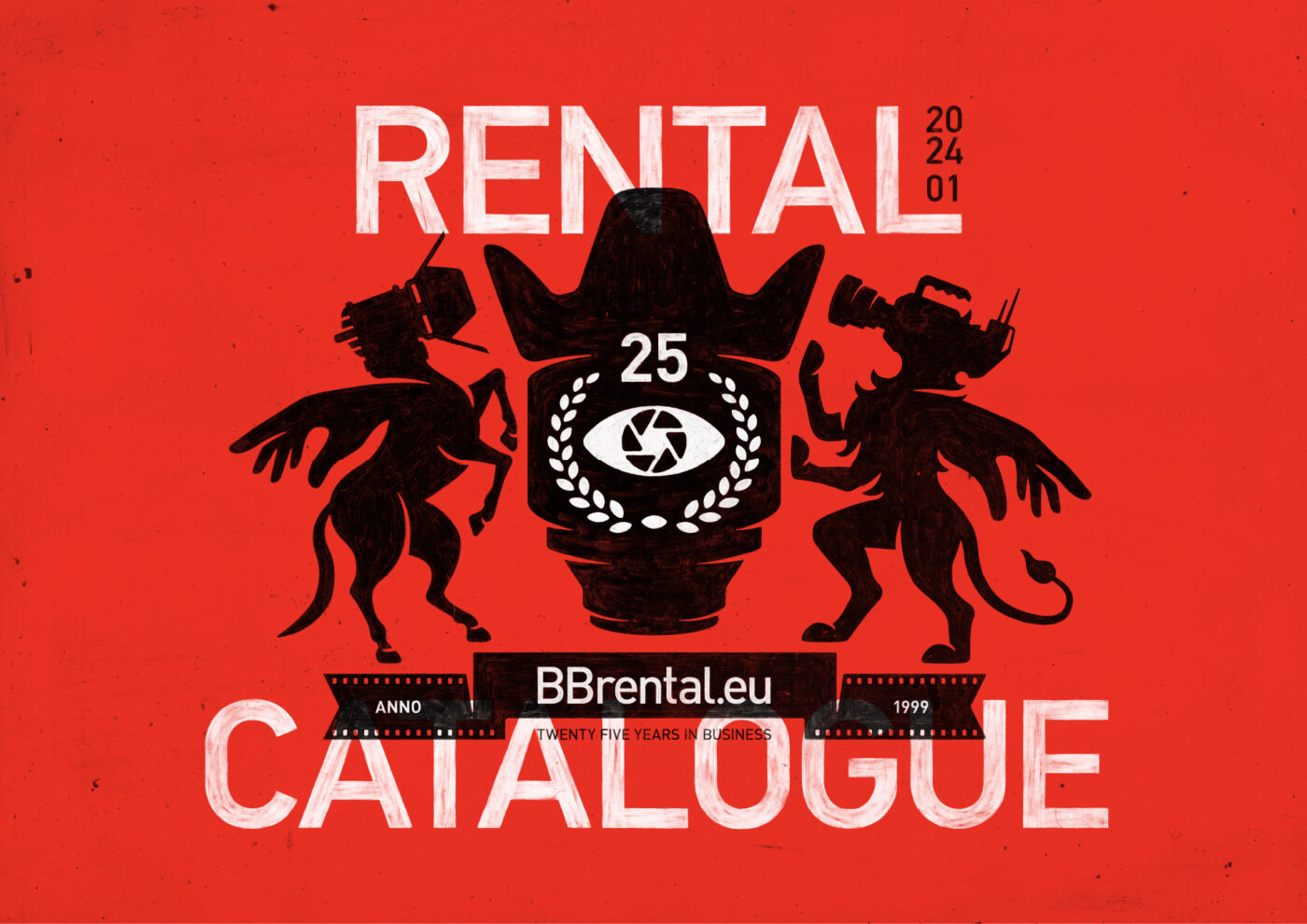
It Starts Here.
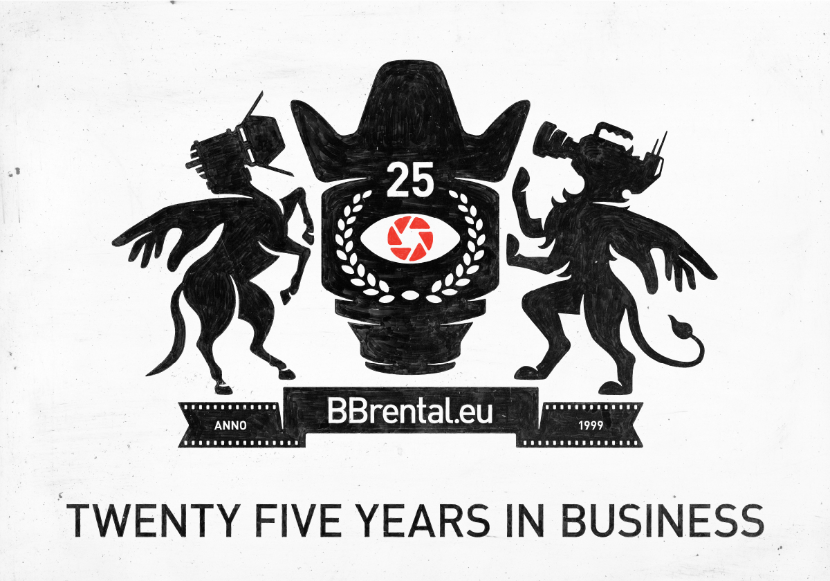
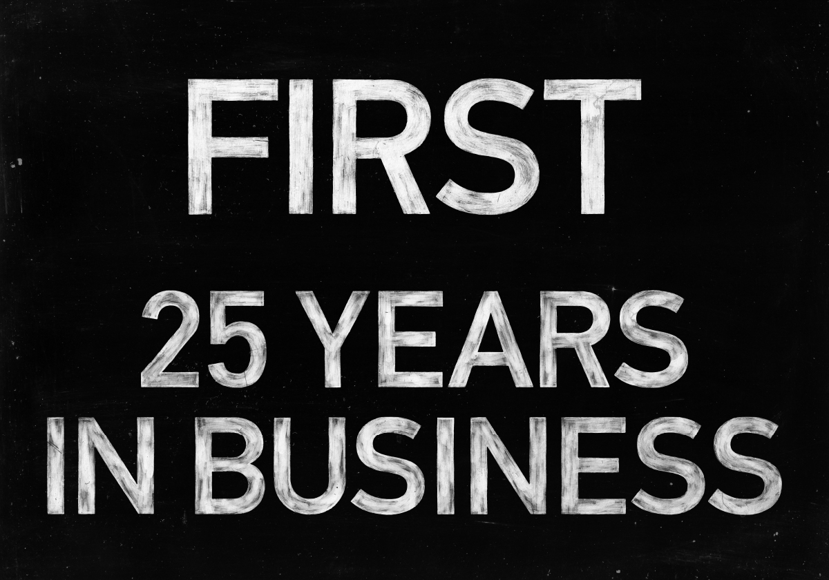
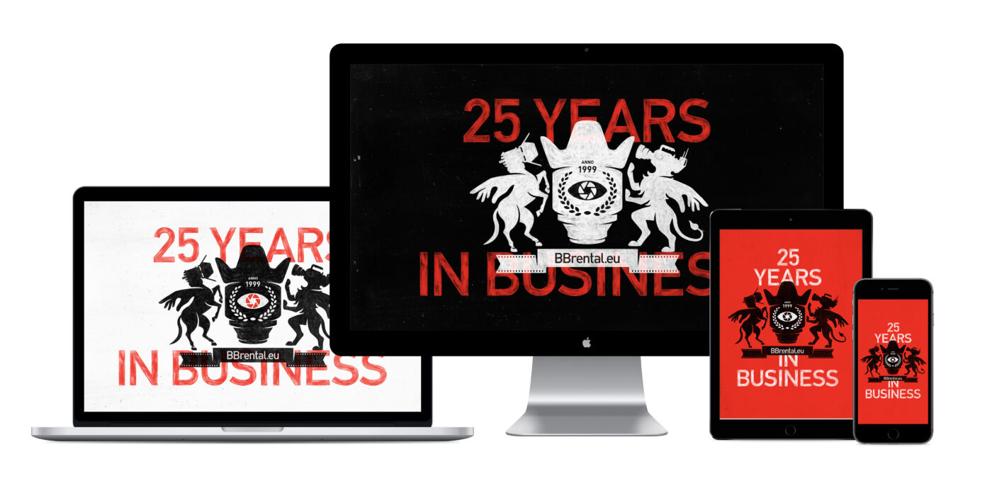
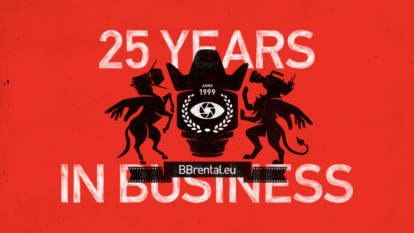
In celebration of our 25th anniversary, we introduce an updated design system that preserves the core elements of the BB brands. This guide provides a synopsis of how the BB brands are brought to life.
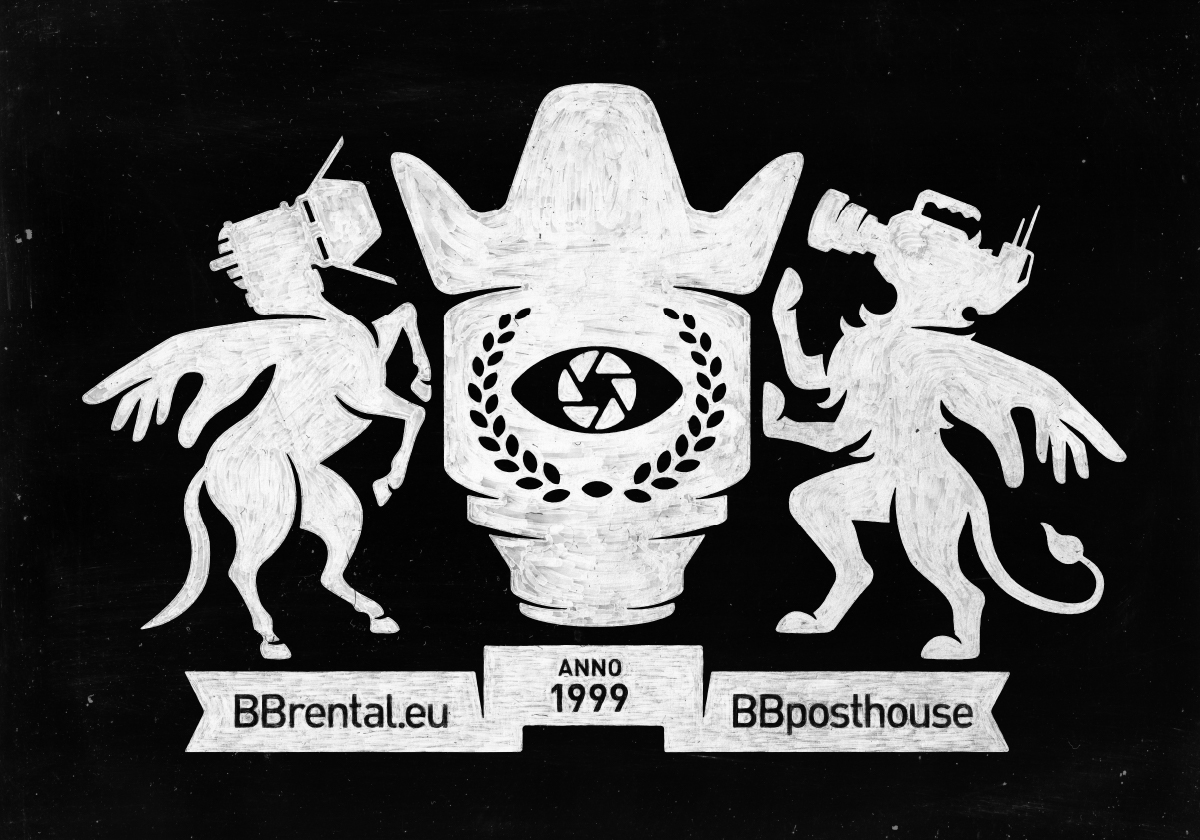
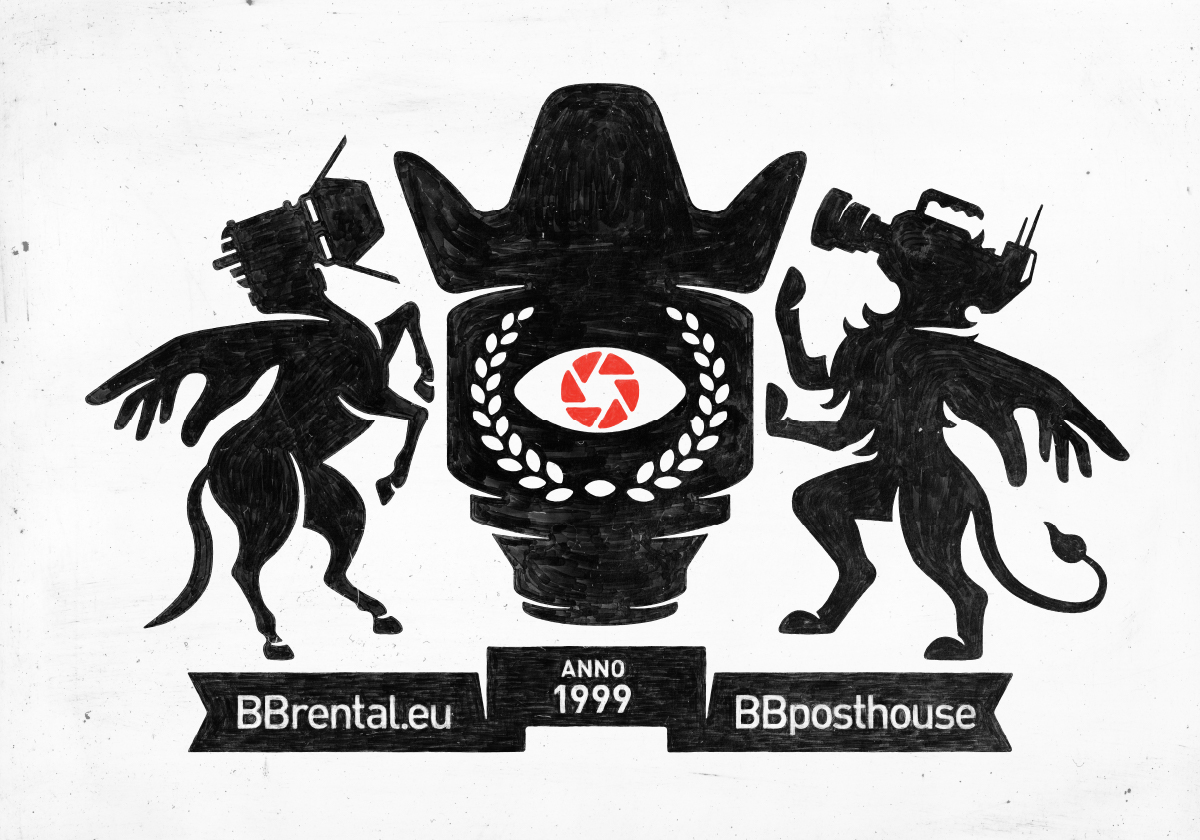
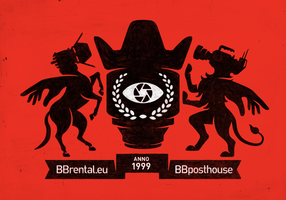
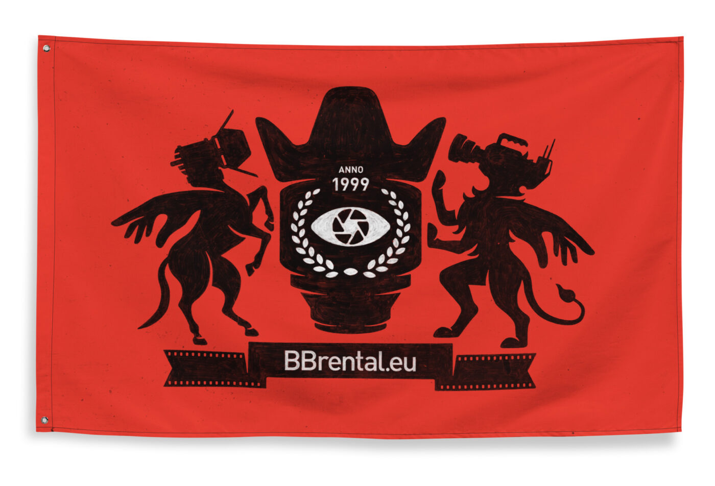
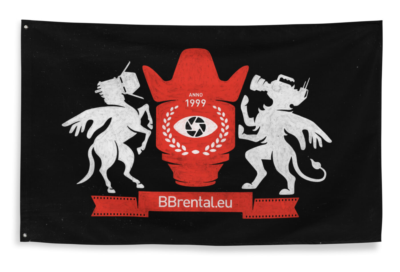
The BB logos are a crucial expression of our brand identity. Each logo has been meticulously designed and constructed to achieve visual harmony and should not be modified. As these elements are highly recognizable and visible brand assets, it is essential that they are always applied consistently.
While there are no unbreakable rules, a few simple guidelines will help you use our logos effectively to communicate the essence of the BB brands.
Logo Components
The BB logo is composed of the following elements.
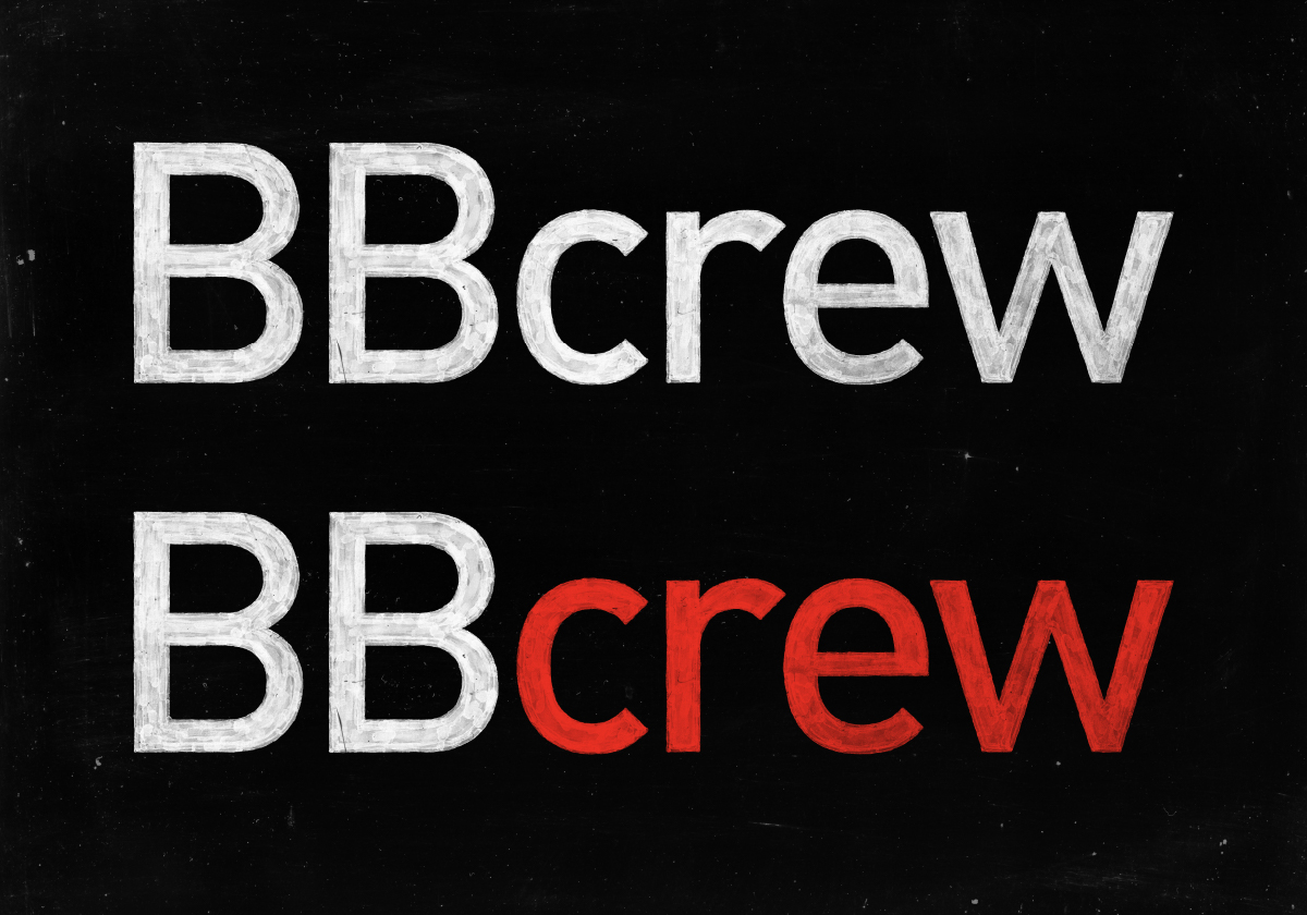
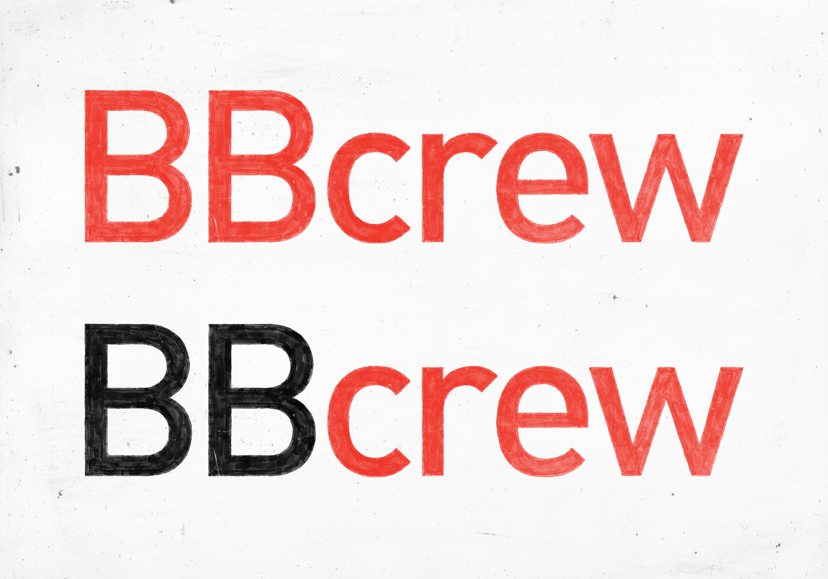
BB Initials
Originally derived from “Best Baltic,” today “BB” represents whatever you want it to be—whether it’s “Block Buster,” “Building Brilliance,” “Beyond Boundaries,” “Bright Bridge,” or any other interpretation.
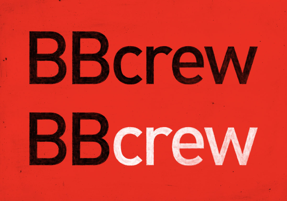
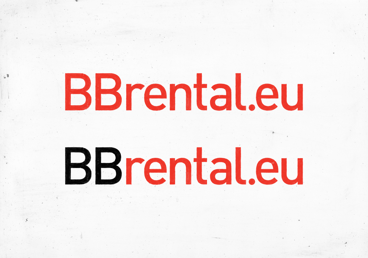
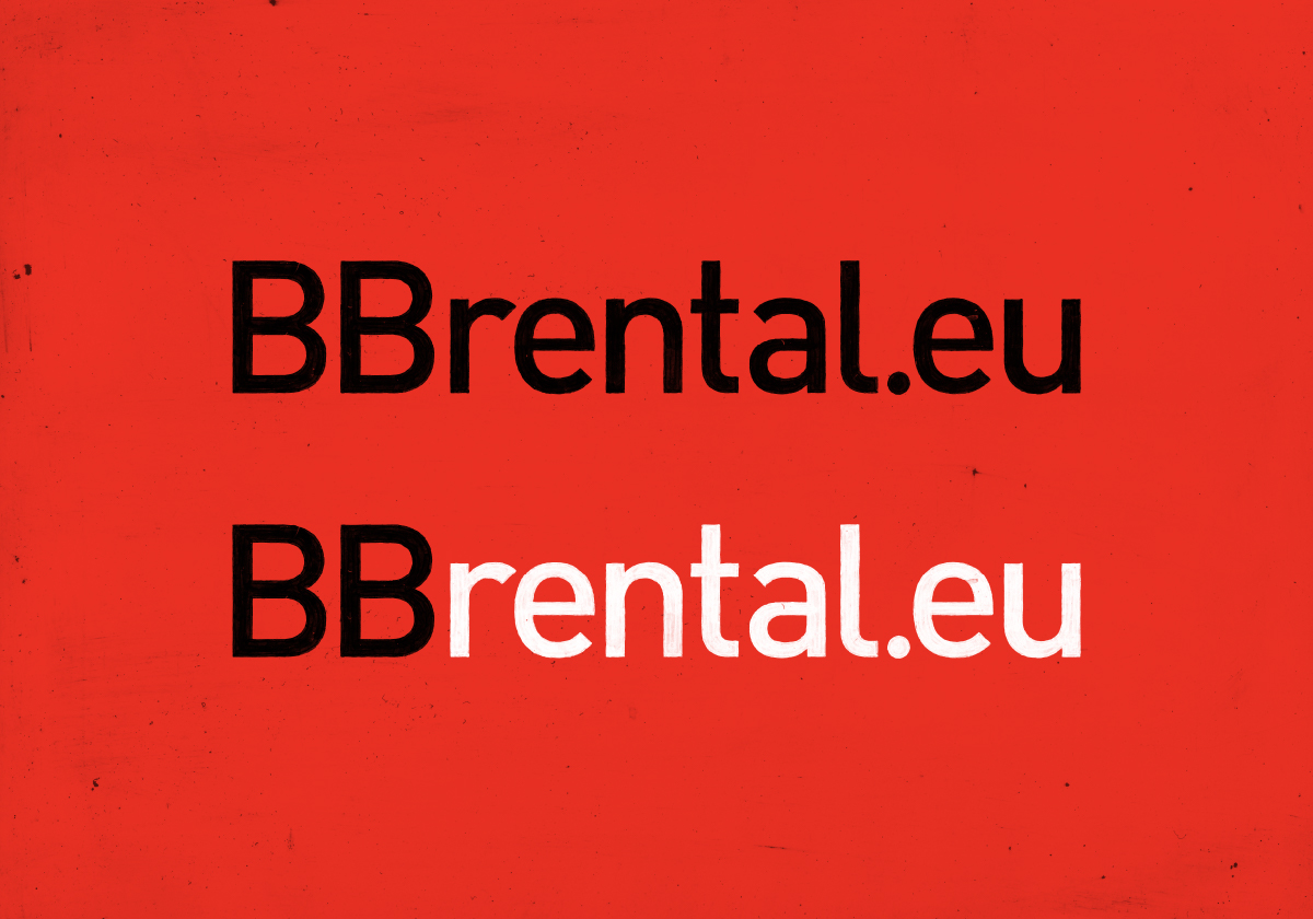
“BB” should always be in uppercase, followed by the sub-brand in lowercase. This letter casing should also be used in regular text communication (e.g., BBrental.eu, BBposthouse, etc.).
The Wordmark
The wordmark combines “BB” with our service divisions to form a unified brand identity. Examples include:
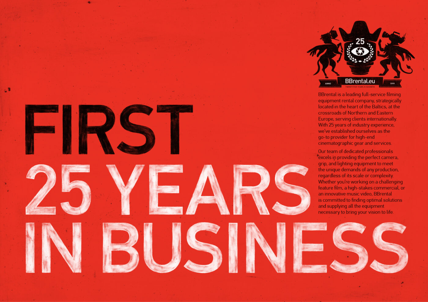
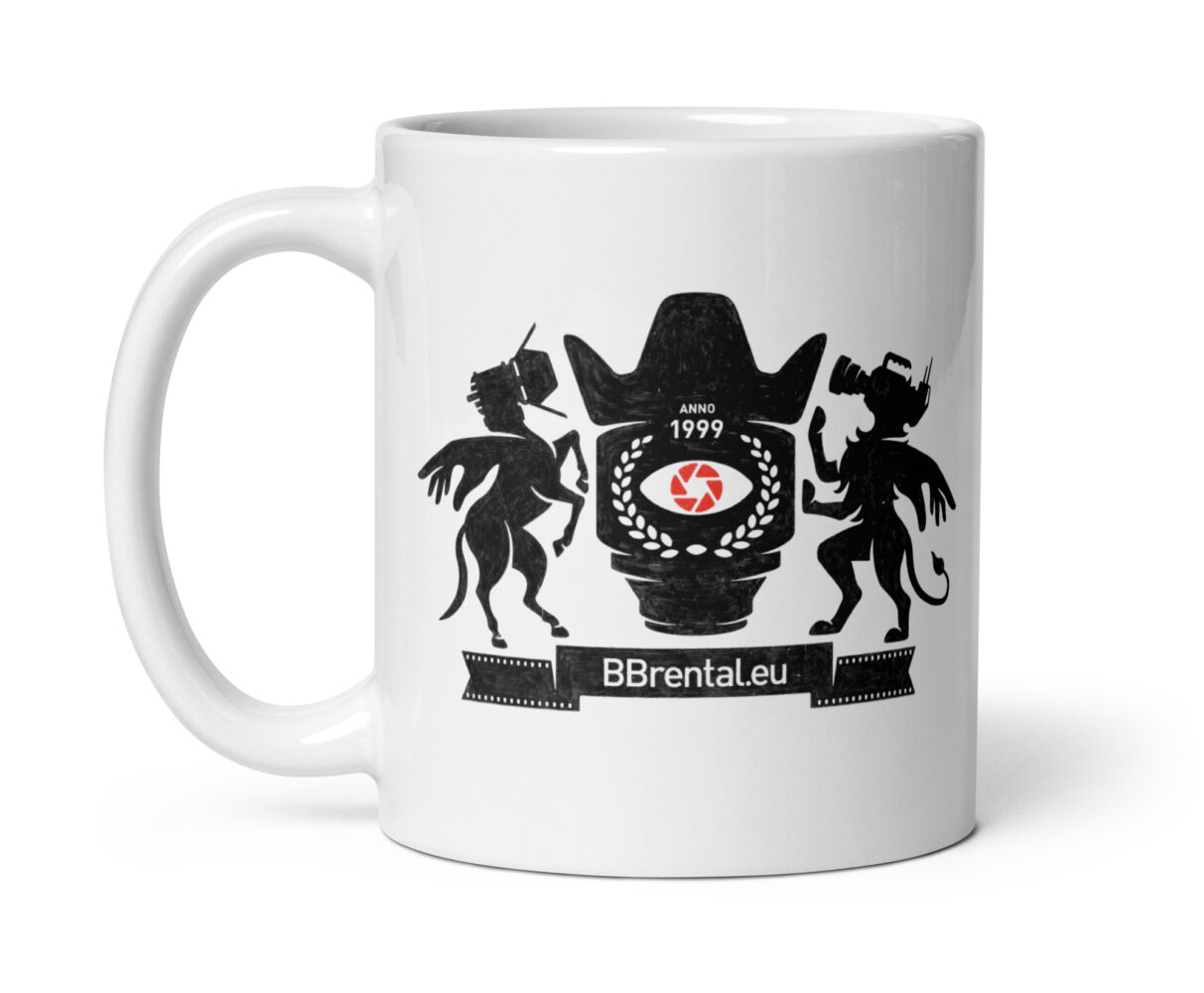
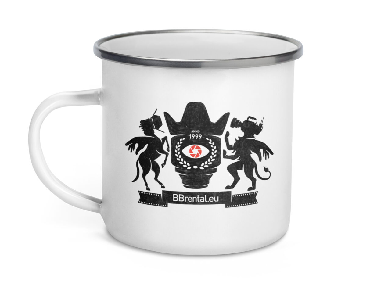
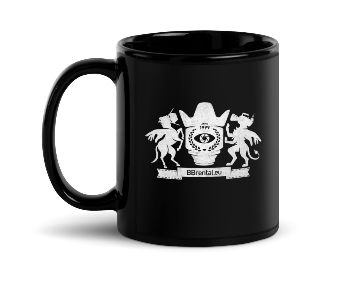
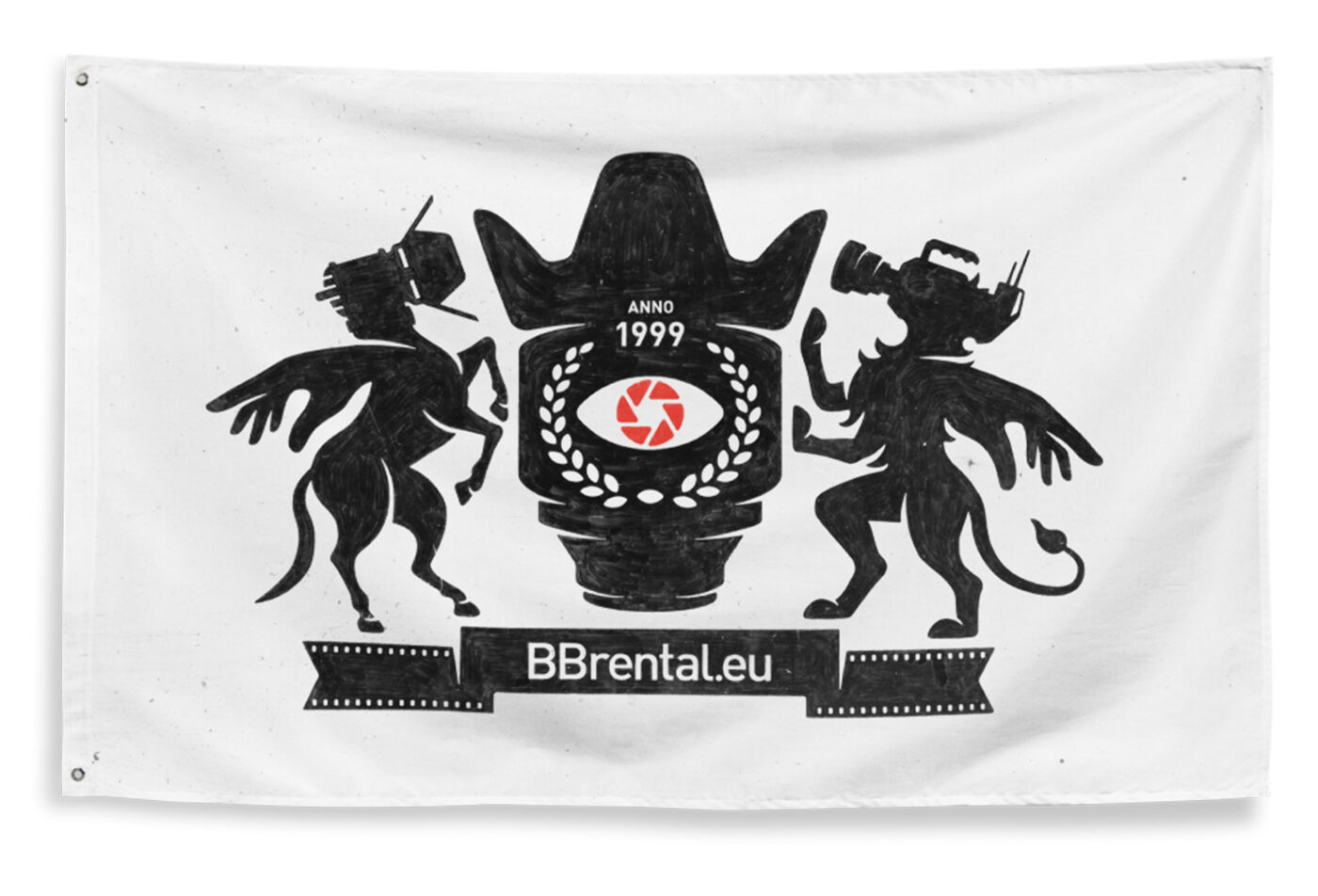
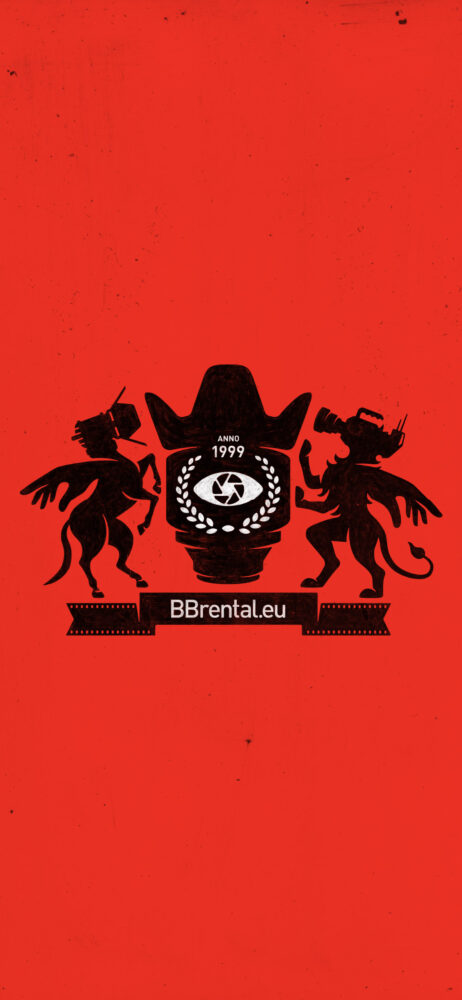
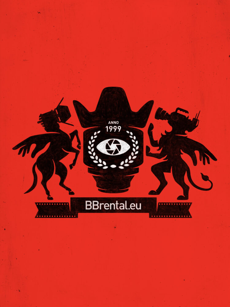
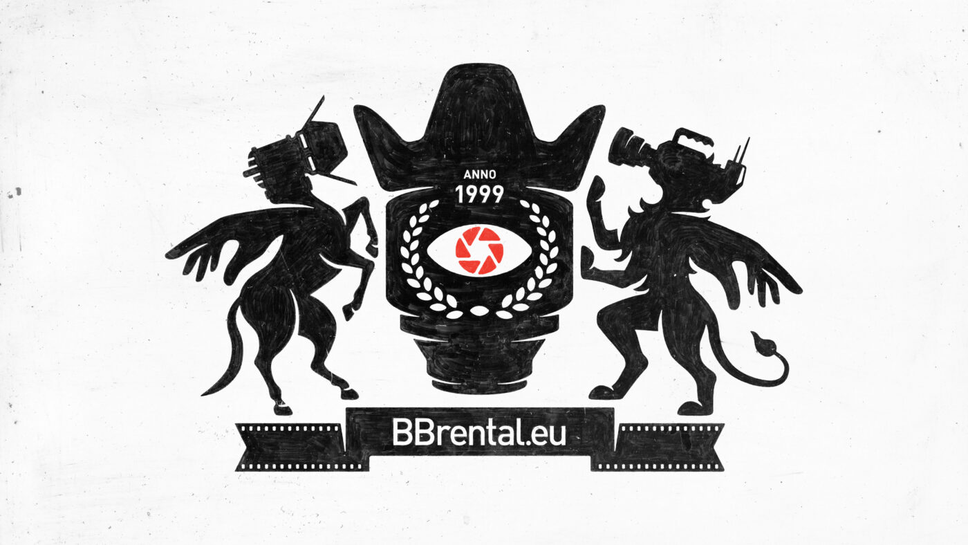
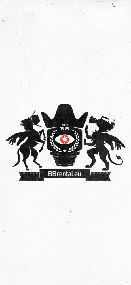
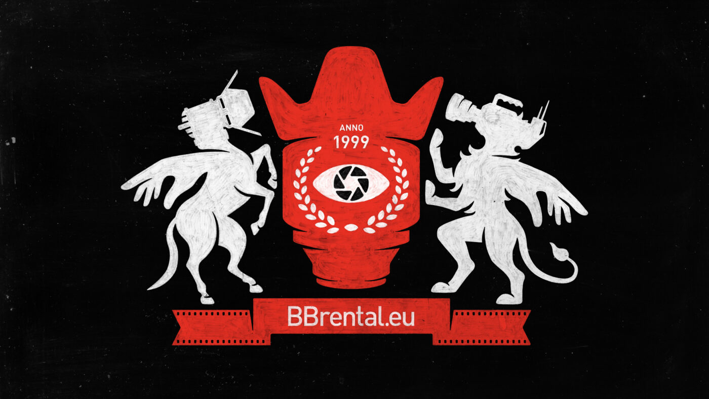
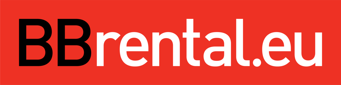
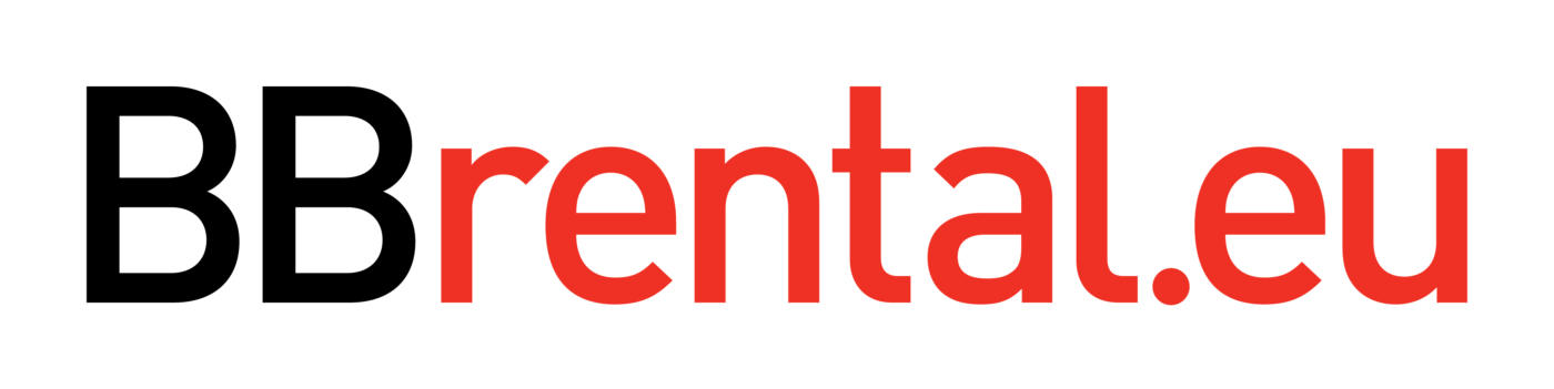
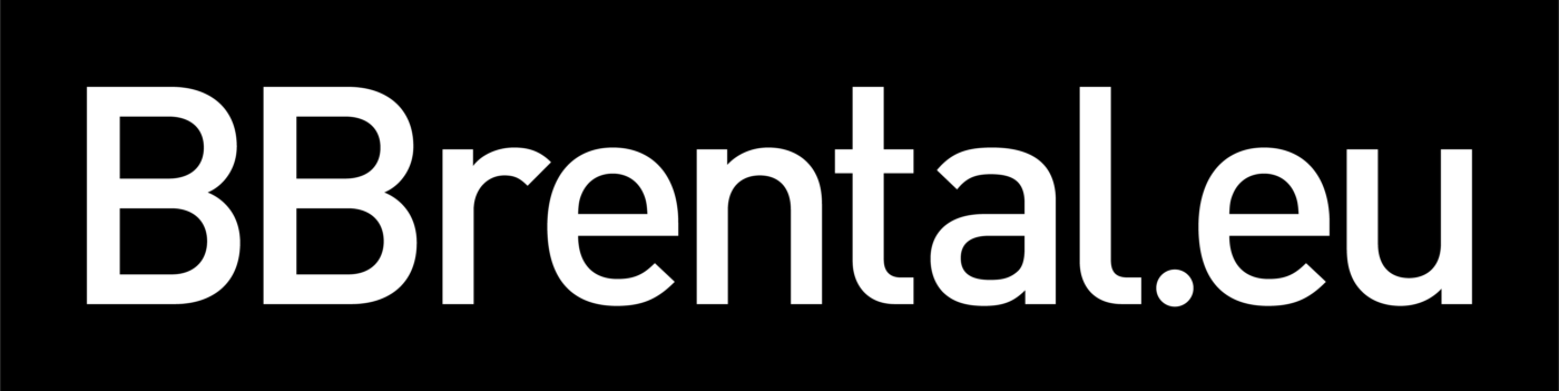
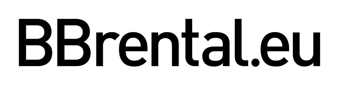
– BBrental.eu: A full-service film equipment rental house located in the heart of the Baltics and operating internationally. Our team of dedicated professionals provides the right camera, grip, and lighting solutions, regardless of production size or needs.
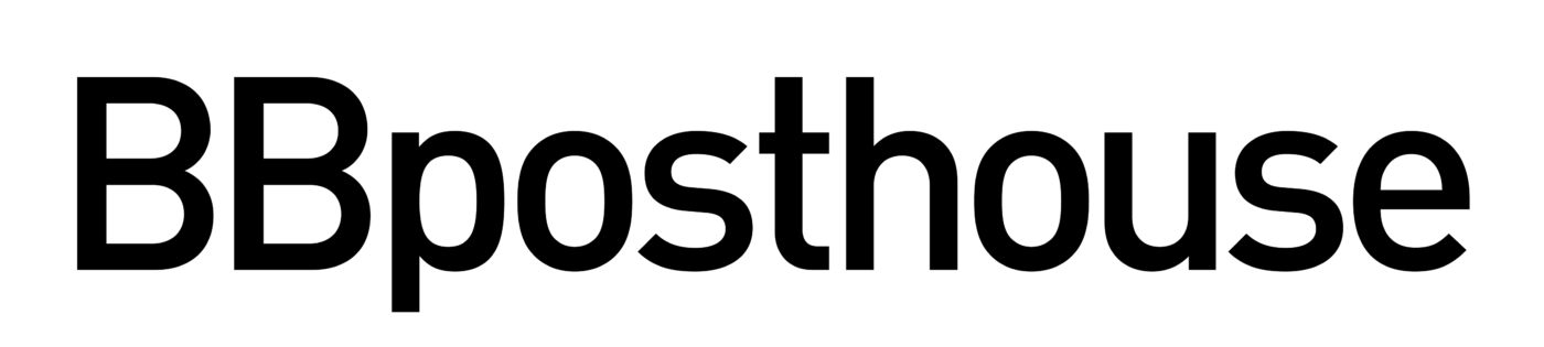
– BBposthouse: Postproduction services.
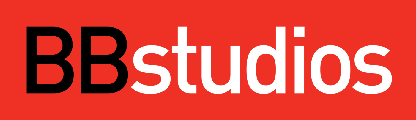
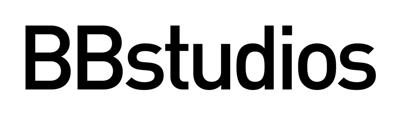
– BBstudios: Production services.
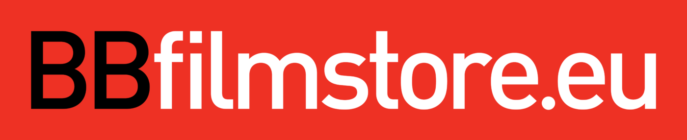
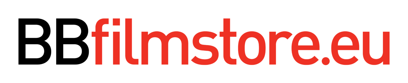
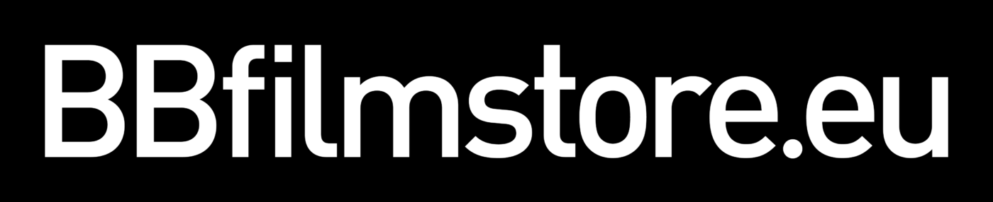
– BBfilmstore.eu: Sales of film equipment.
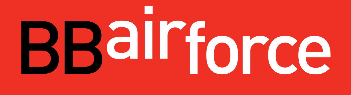
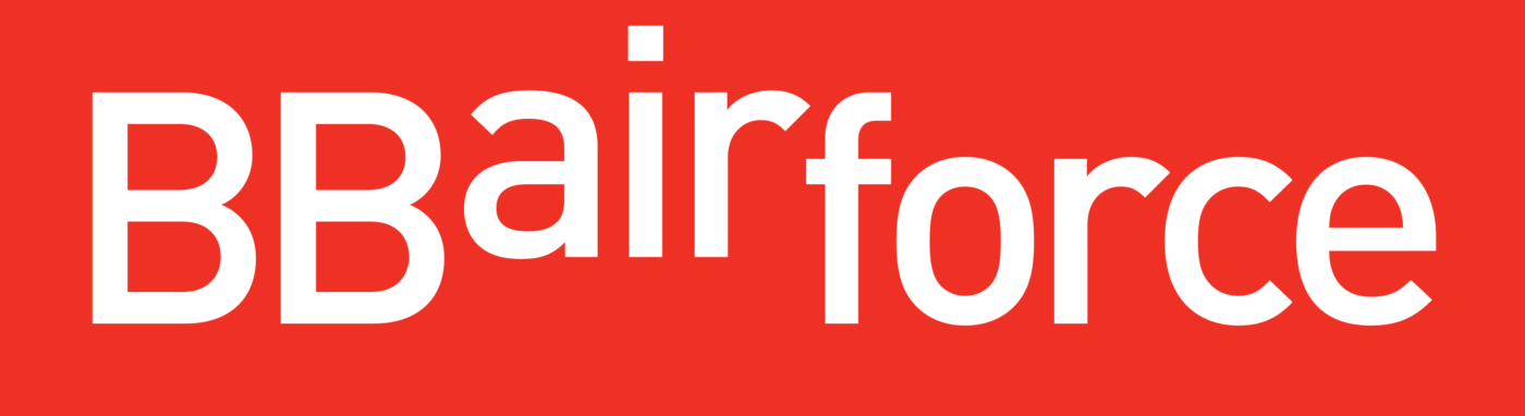
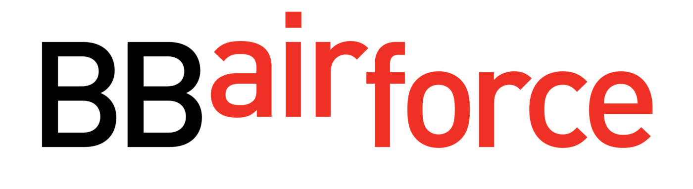
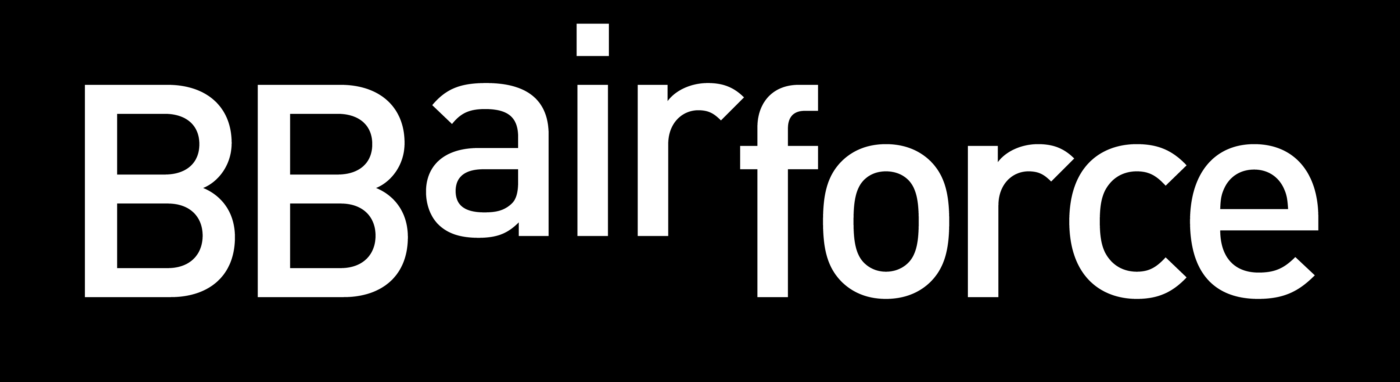
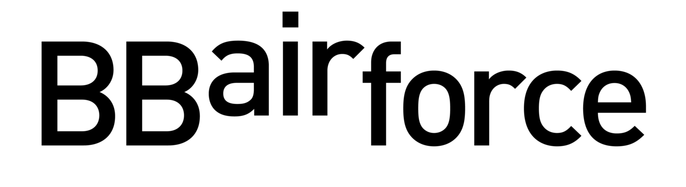
– BBairforce: Filming drone services and rentals.
Logo Frame
The logo frame serves as a canvas for creativity—a space where stories are composed.
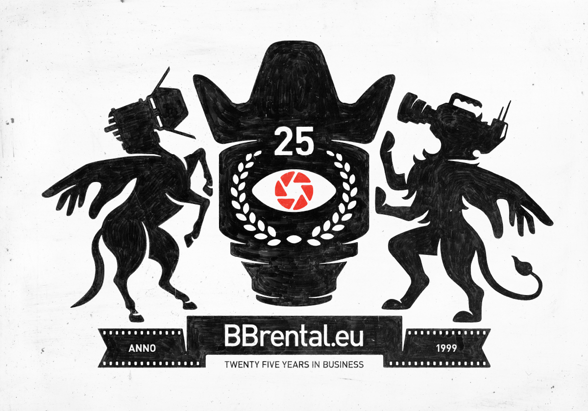
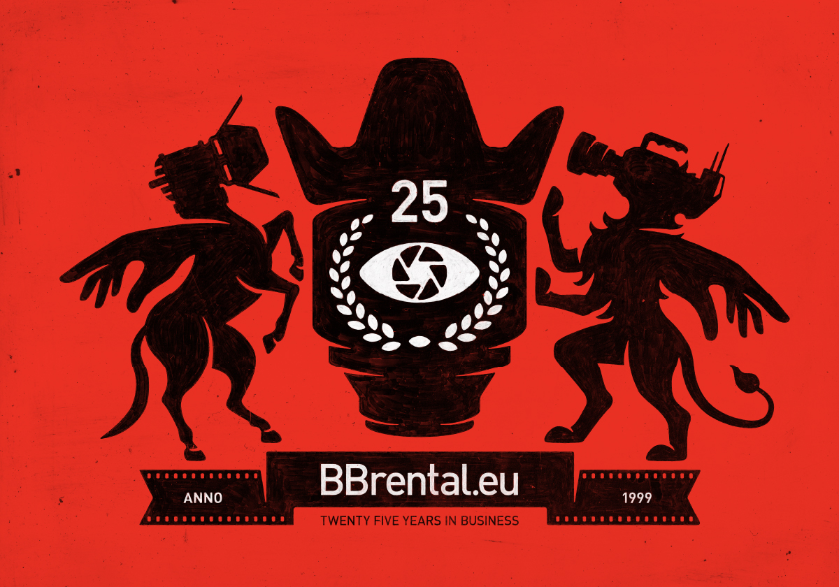
Color Palette
– Black and White: These colors symbolize cinema itself. Without the interplay of black and white, motion pictures wouldn’t exist. They illuminate and tell stories.
– Red: Represents the burning fire of passion and creativity. In serving directors, producers, and DOPs, we believe in the power of creativity and the art of storytelling.
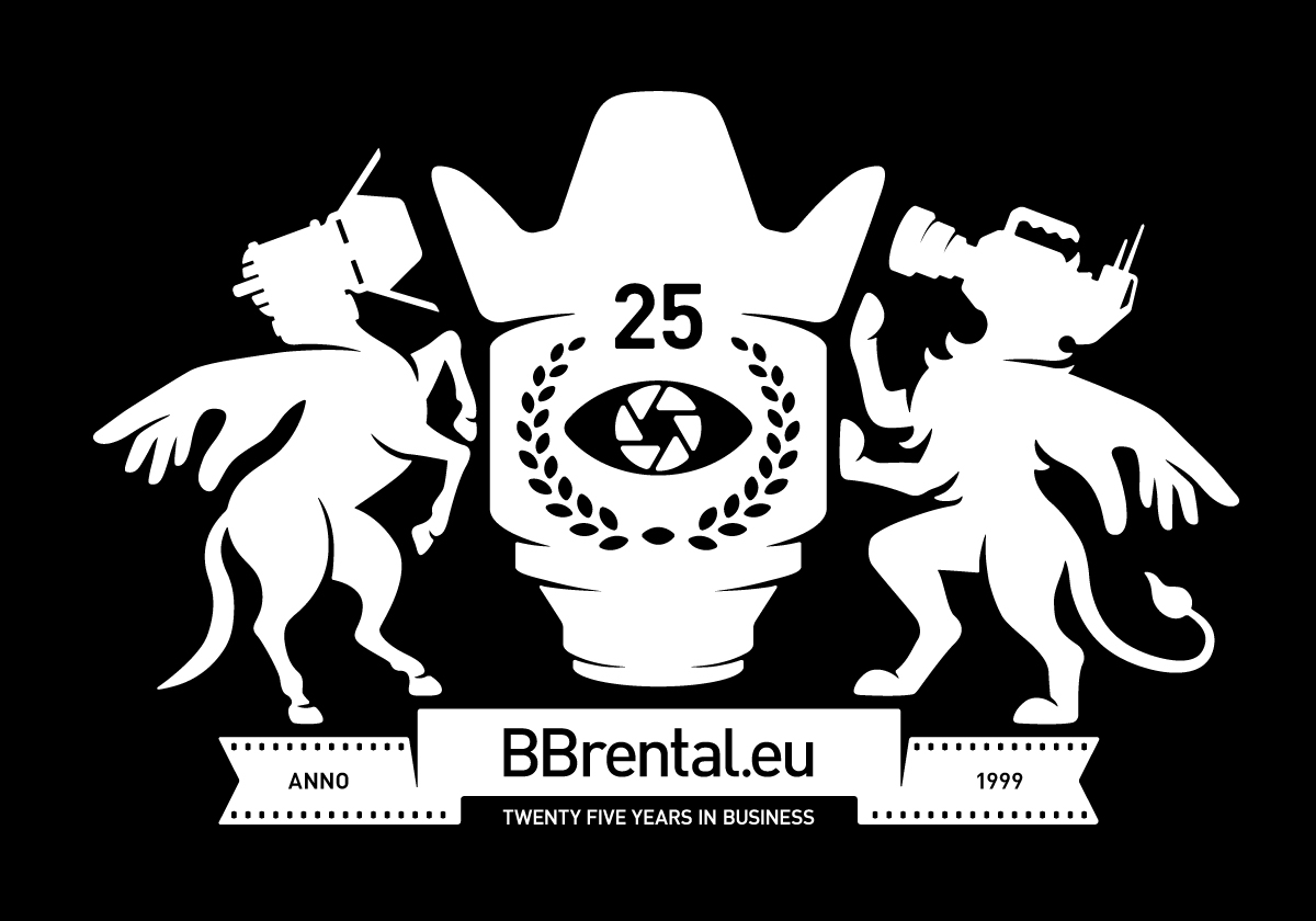
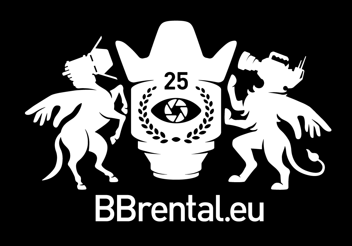
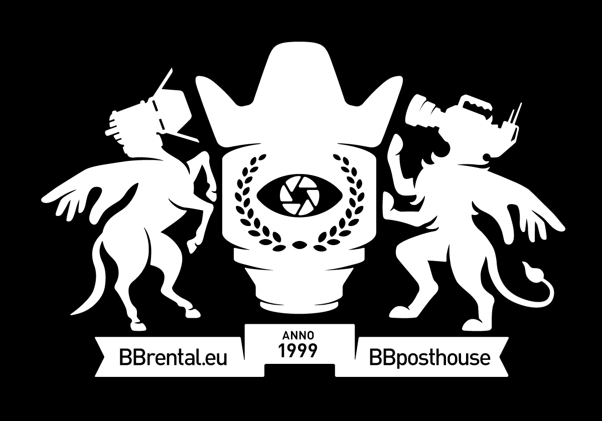
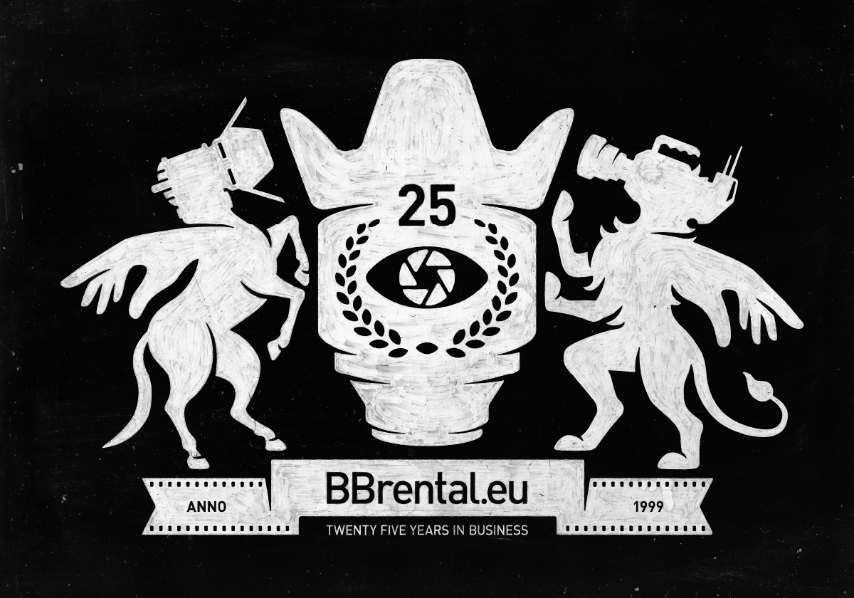
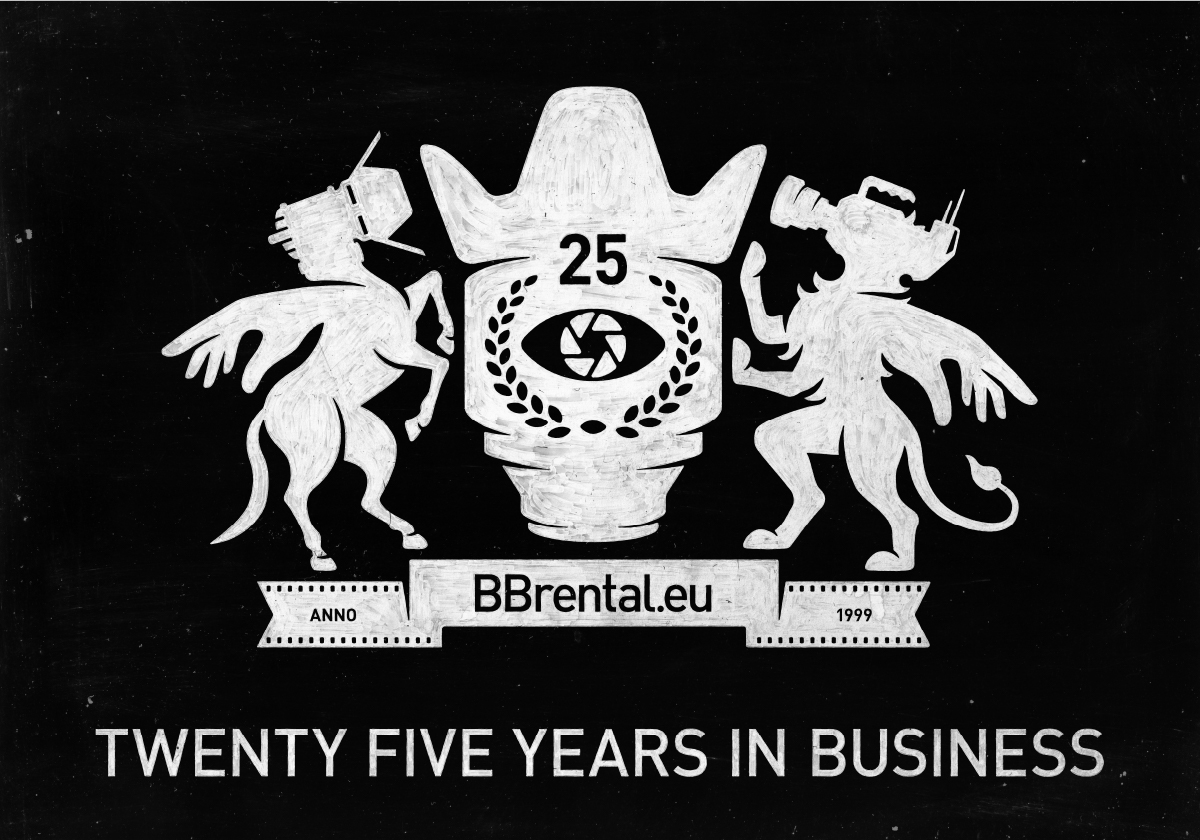
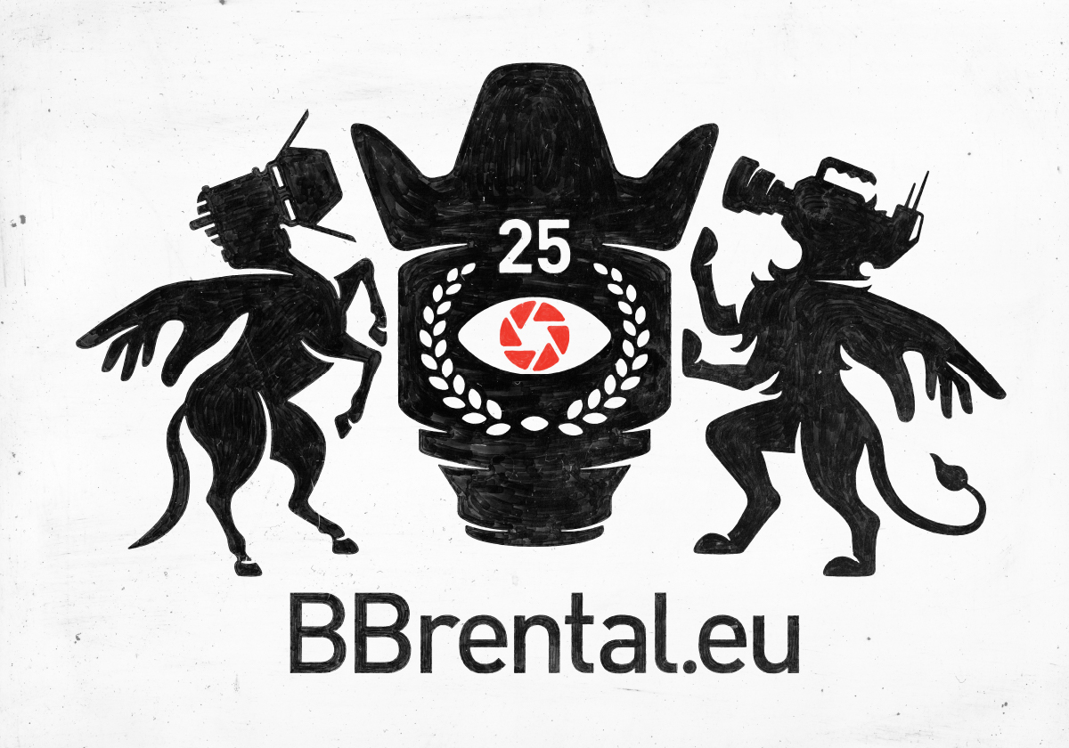
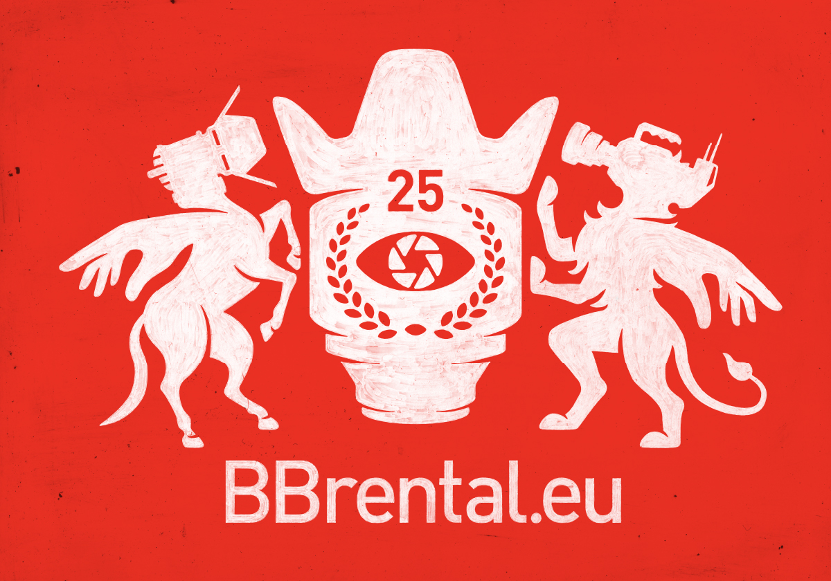
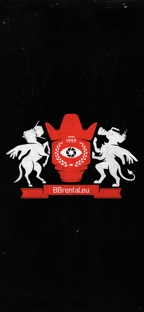
1.1 BB base logo
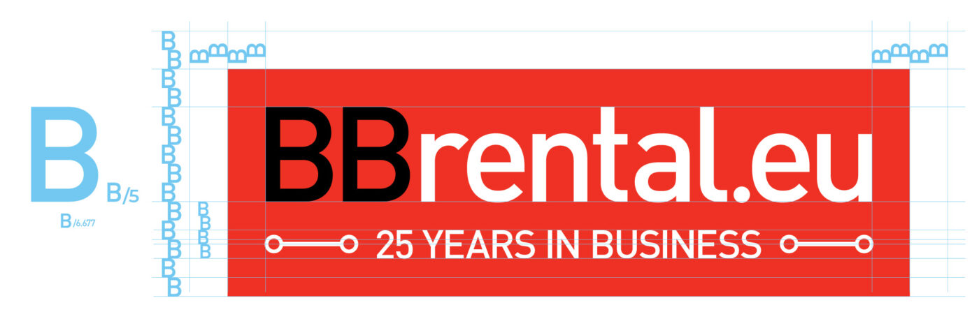
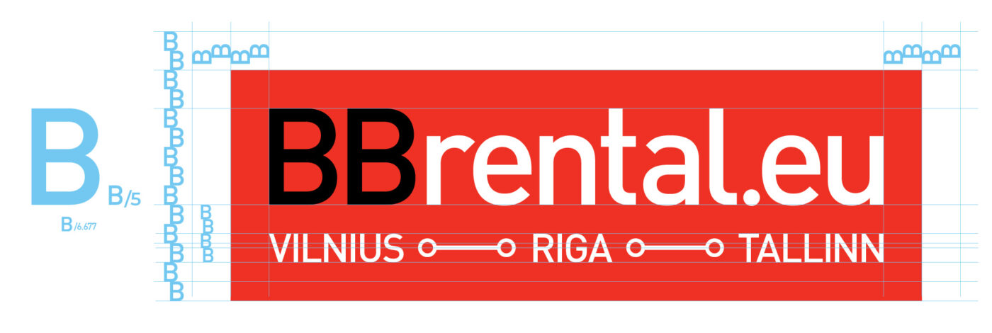
2.1 Logo Construction and Clear Space
The clear space ensures the logo’s legibility and impact by isolating it from competing visual elements, such as text or supporting graphics.
Use 1/5 of the height of the letter “B” to create the logo frame around the wordmark.

2.2 Extended Logo Construction and Clear Space
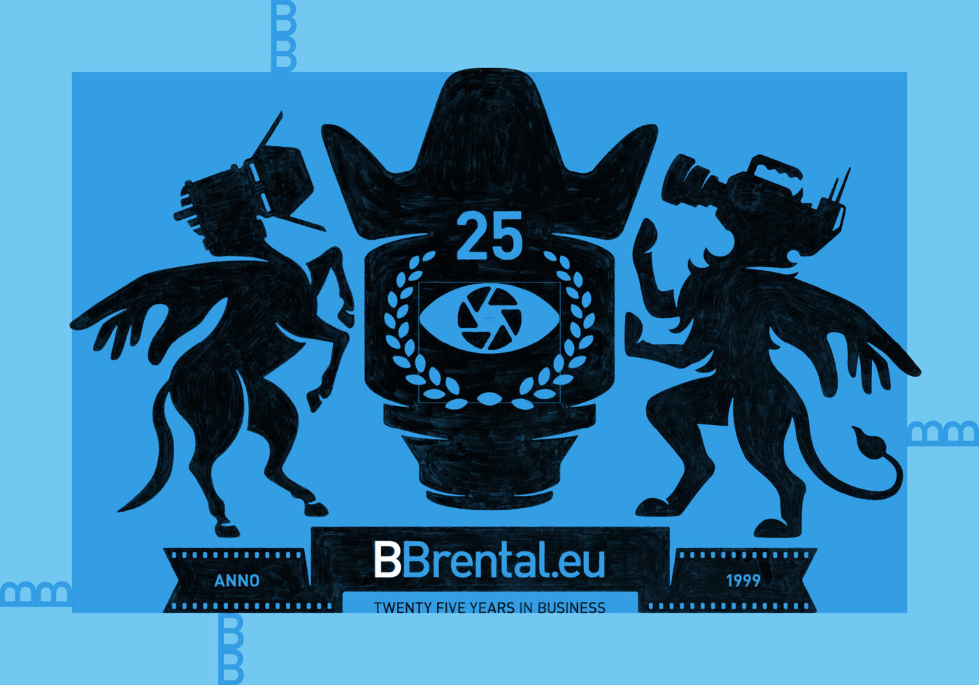
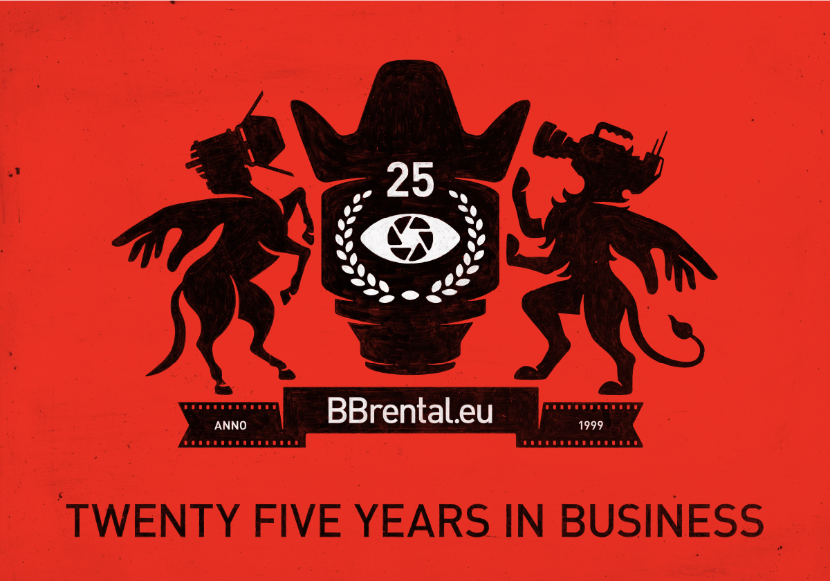
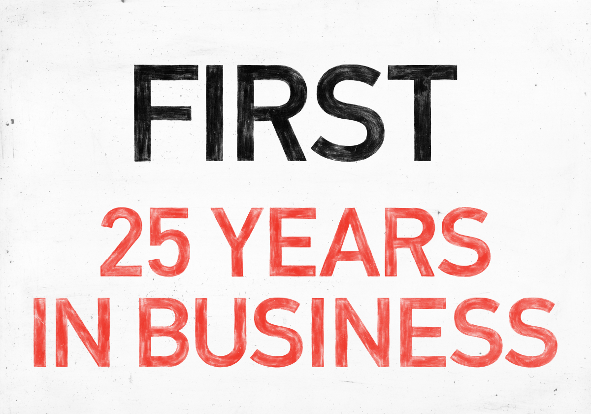
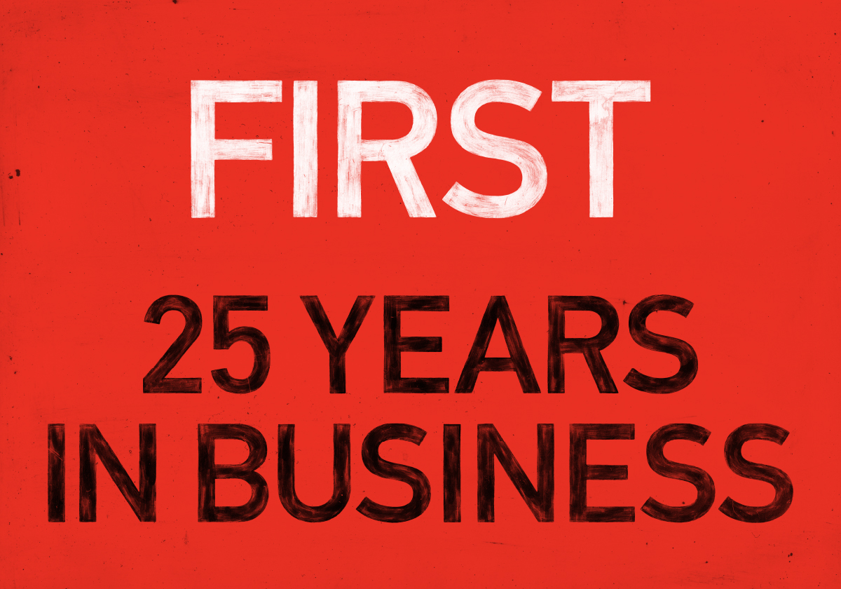
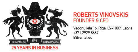
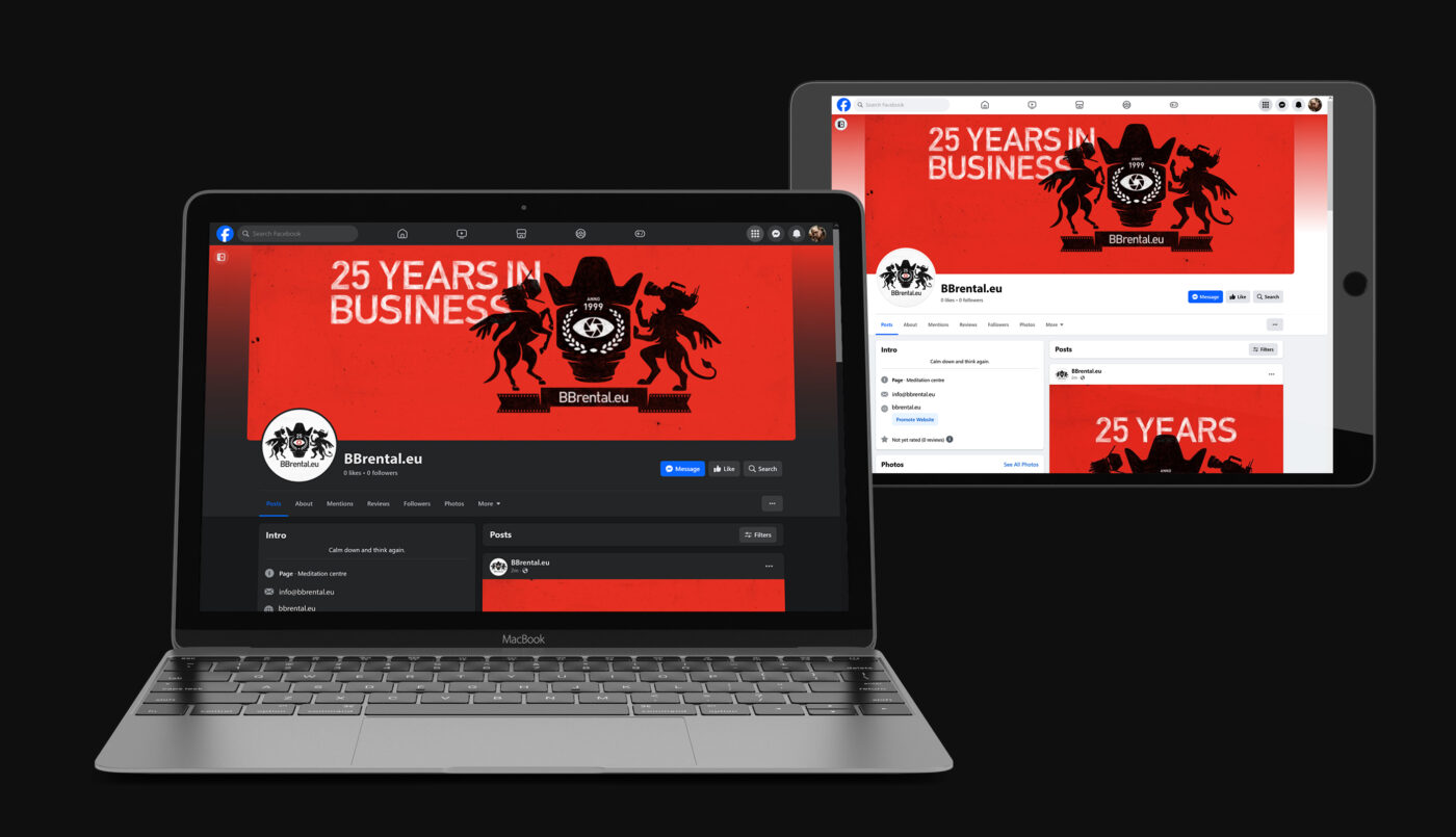
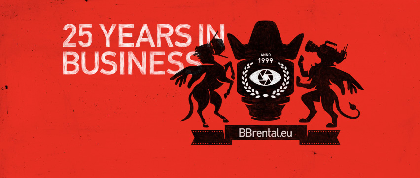
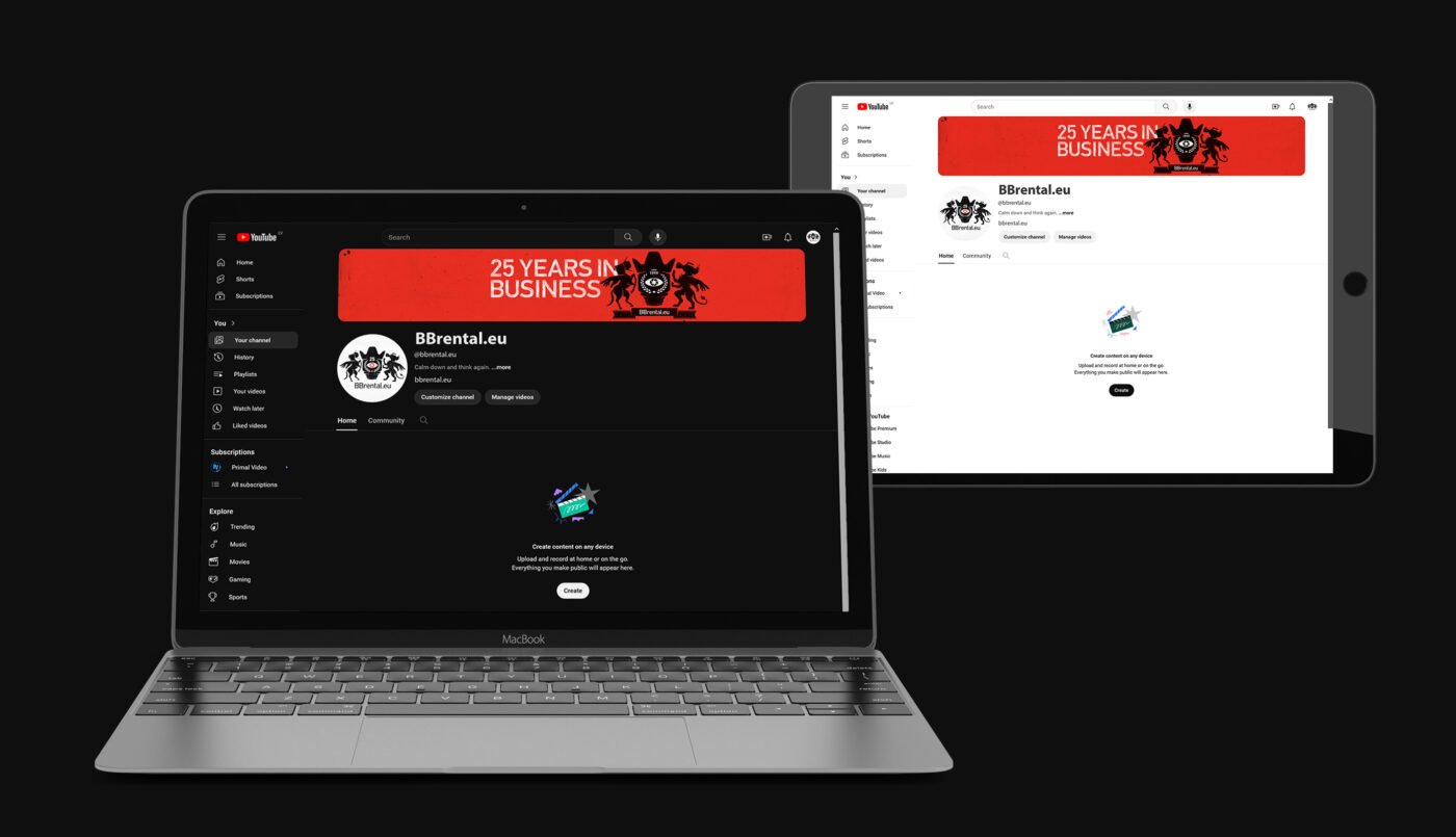
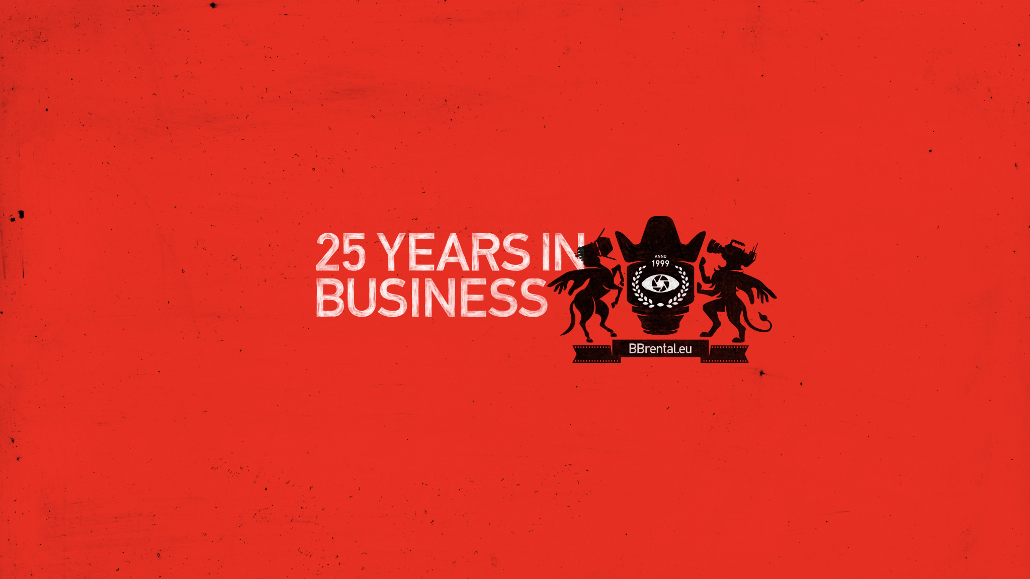
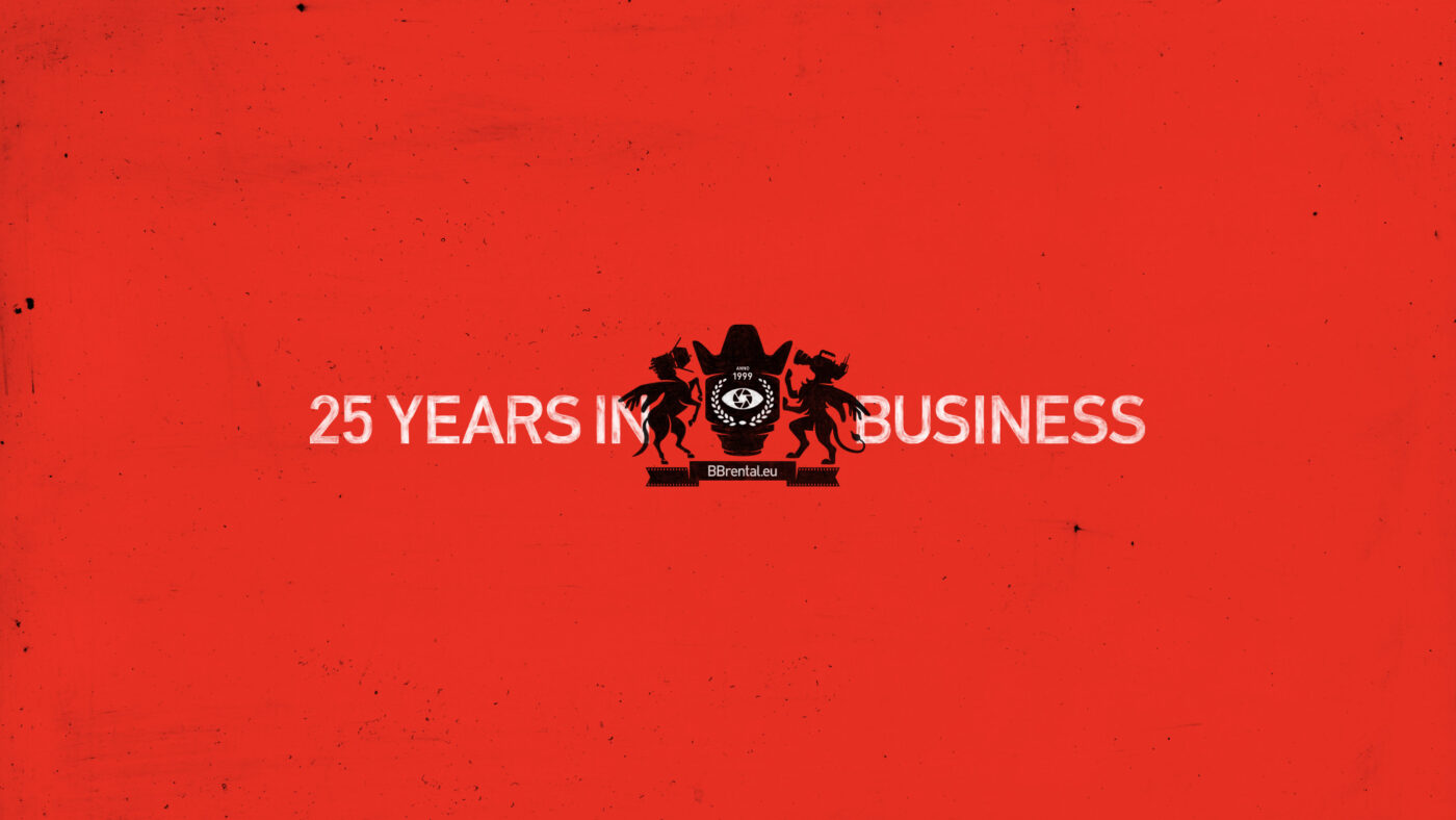
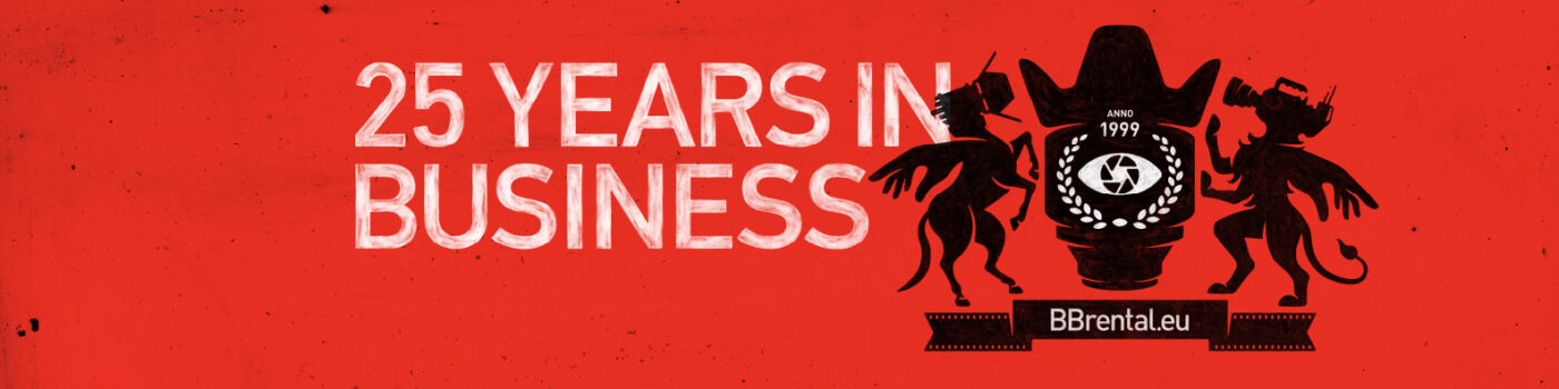
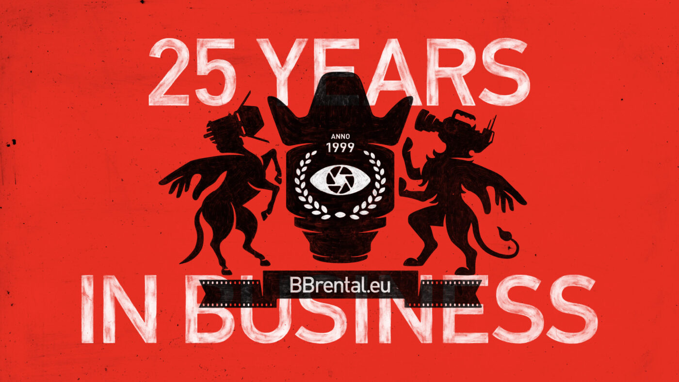
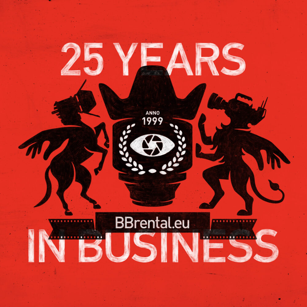
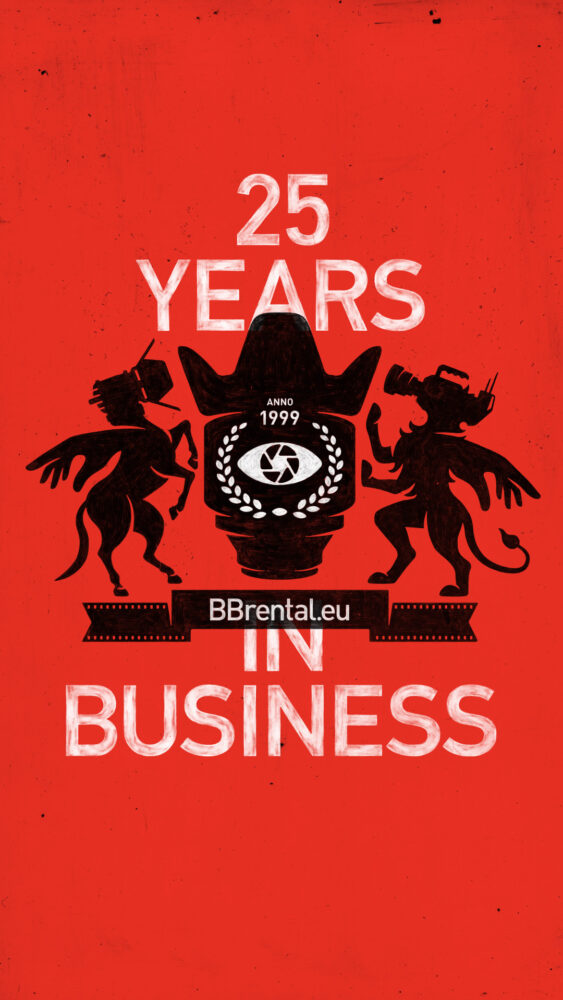
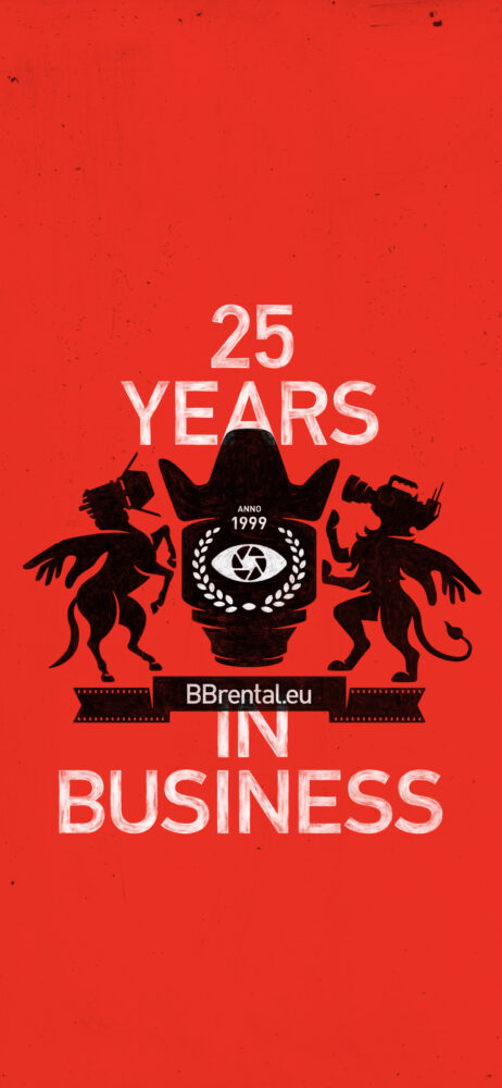
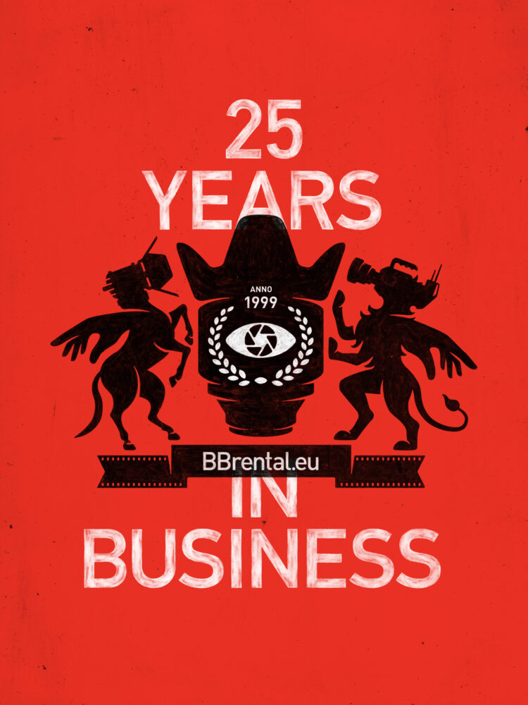
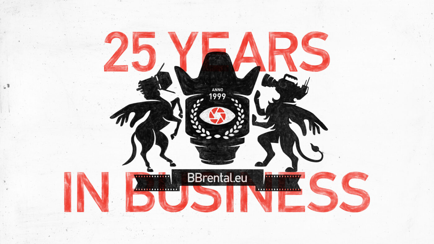
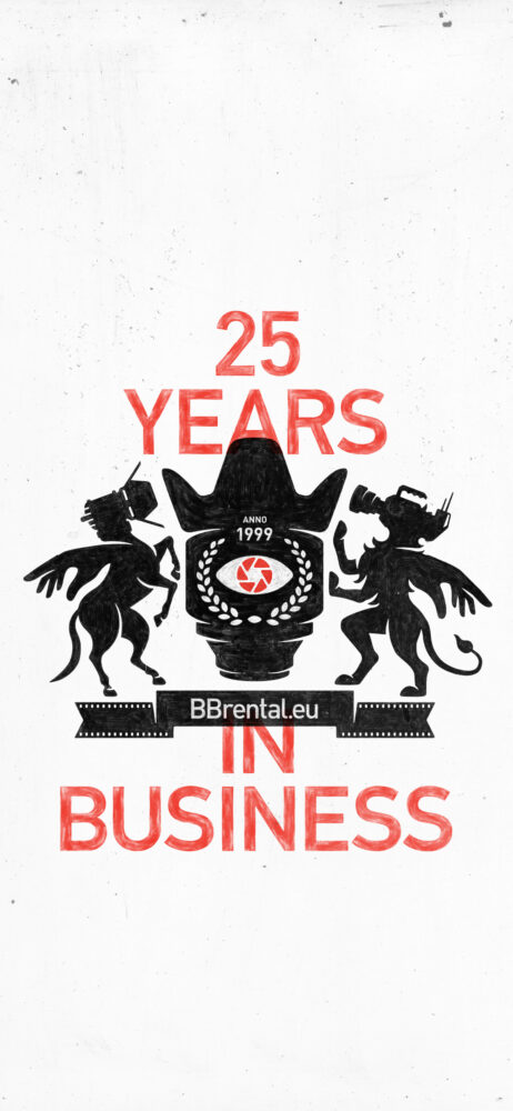
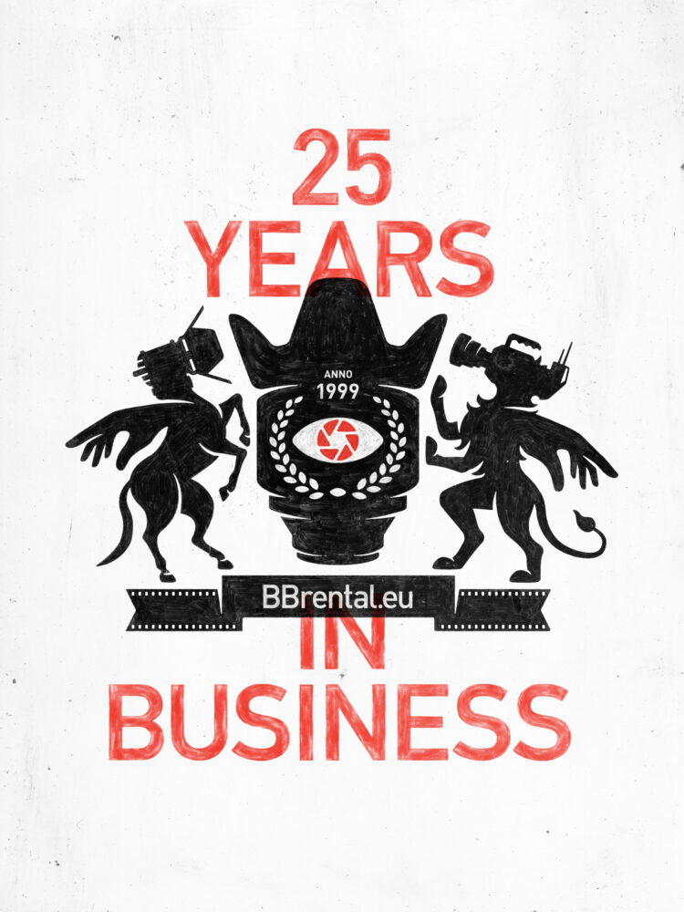
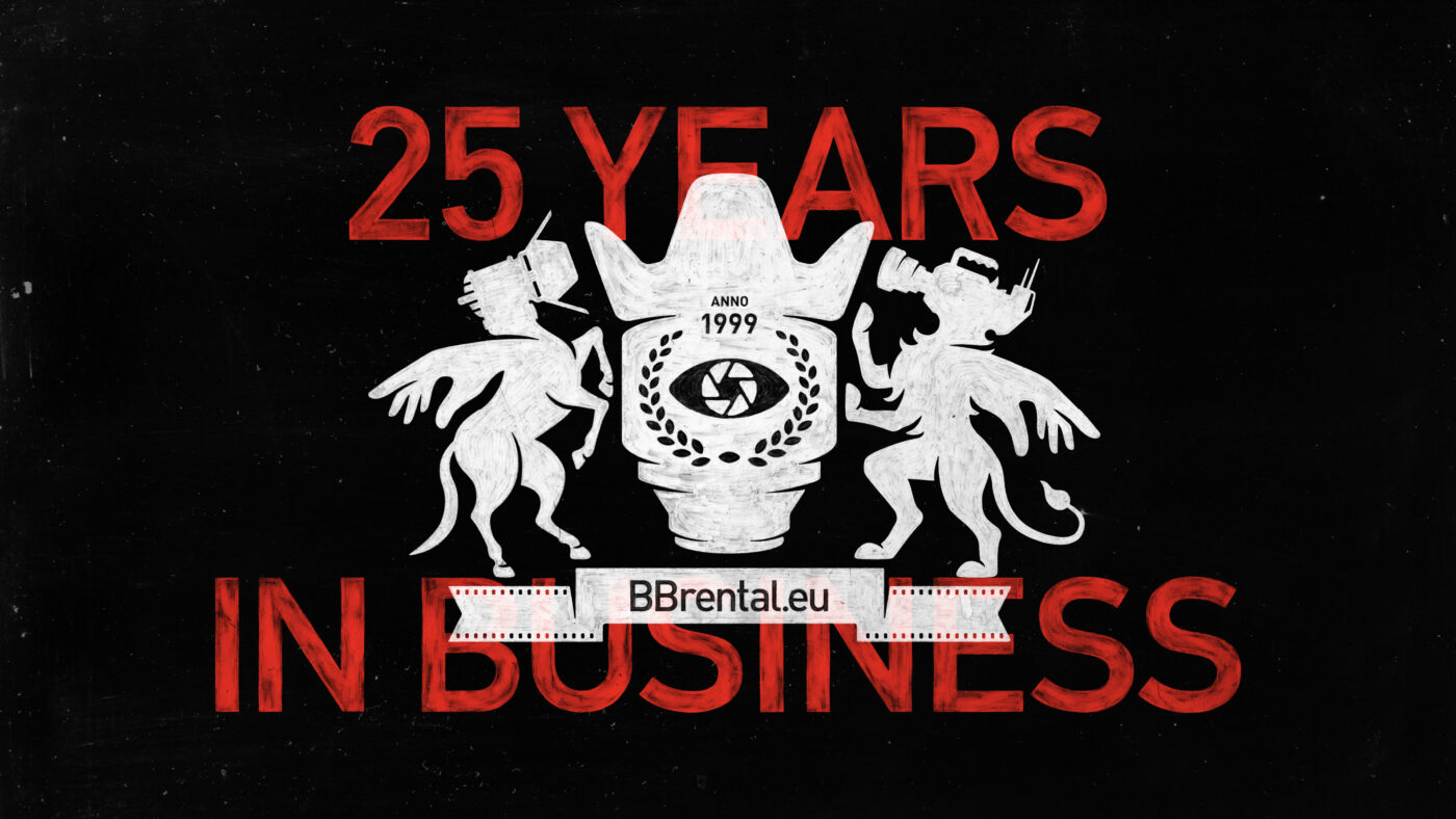
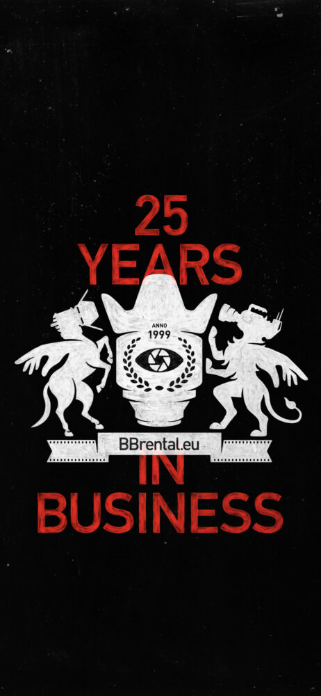
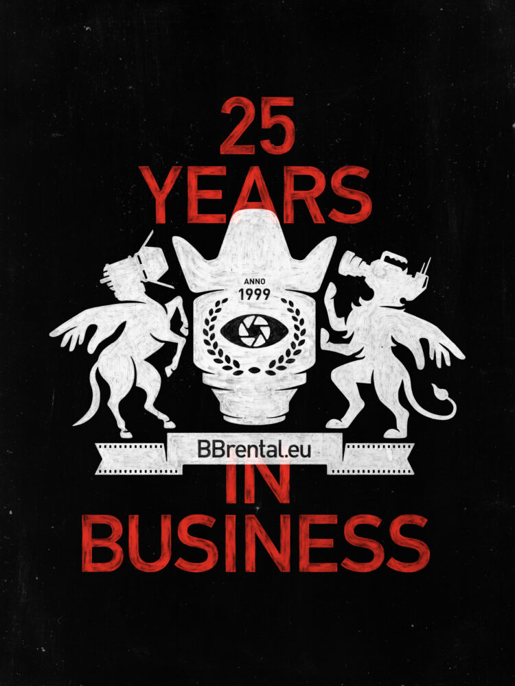
For the construction of an extended logo (e.g., one featuring slogans like “25 Years in Business,” city names such as “Vilnius – Riga – Tallinn”, or gear labels like “Camera – Light – Grip”), in addition to the standard 1/5 of the B height, use an additional 1/6.677 of the B height.
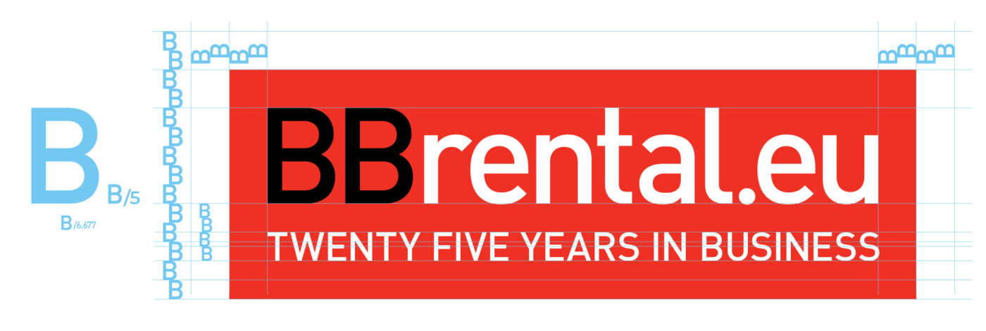
To facilitate easier alignment with different slogan lengths and text variations, a graphic element consisting of a line with dots may be used.
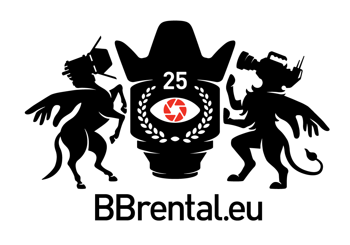
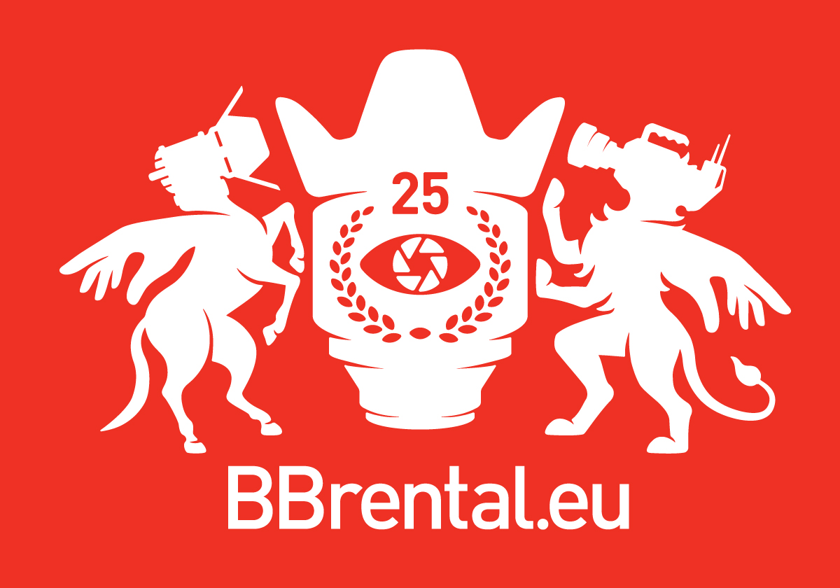
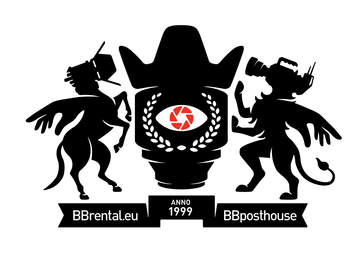
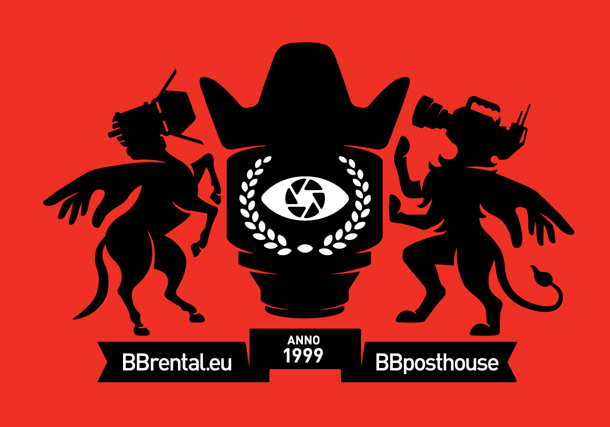
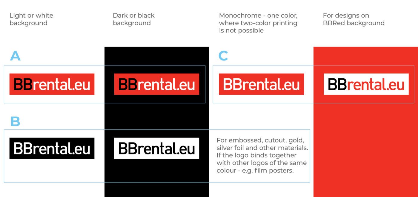
3.1 BB colors
Prioritize the use of color in the following order:
A. BBred
B. BBblack and BBwhite
C. BBgrey

BBred
RGB 238 49 36
#EE3124
CMYK 0 95 100 0
Pantone 485 C

BBblack
RGB 0 0 0
#000000
CMYK 0 0 0 100
Pantone Process Black C

BBwhite
RGB 255 255 255
#FFFFFF
CMYK 0 0 0 0
Paper White

BBgrey
RGB 64 64 64
#404040
CMYK 0 0 0 90
Pantone XXX
RAL 7016
3.2 Color use
A, B, C – Please follow this priority order when selecting which color version to use.
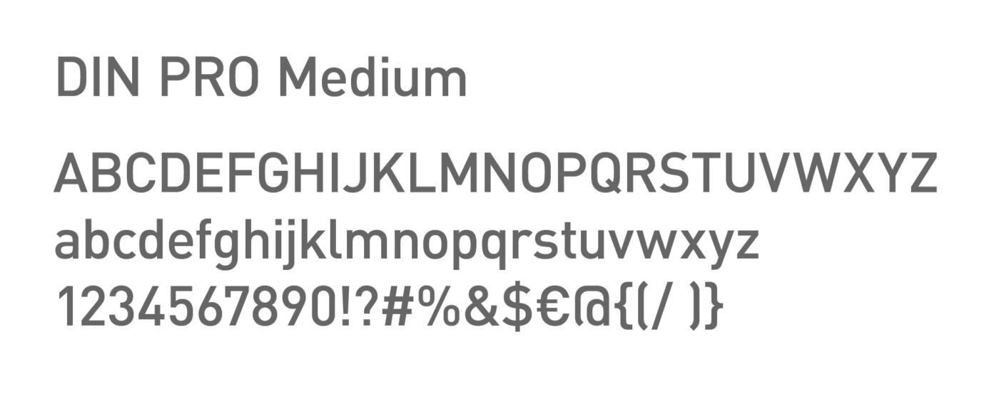
4.1 LOGO Typeface
In the construction of BB logos, DIN Pro Medium is used (not PF DIN Text, DIN 2014, or any other version). Letters should always be manually kerned with a tracking of -48. Additionally, certain elements, such as “t,” “.”, and others, are manually adjusted for optimal alignment.
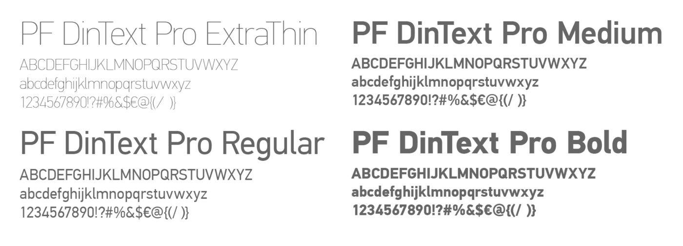
4.2 Typeface for materials
You can use any font from the PF DinText Pro family. For catalogues, we typically use ExtraThin, Regular, Medium, and Bold. However, there are no restrictions on using other fonts from this typeface family.
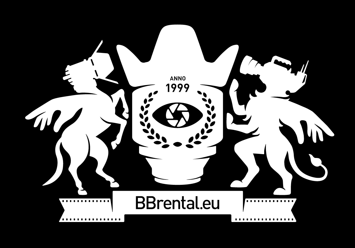
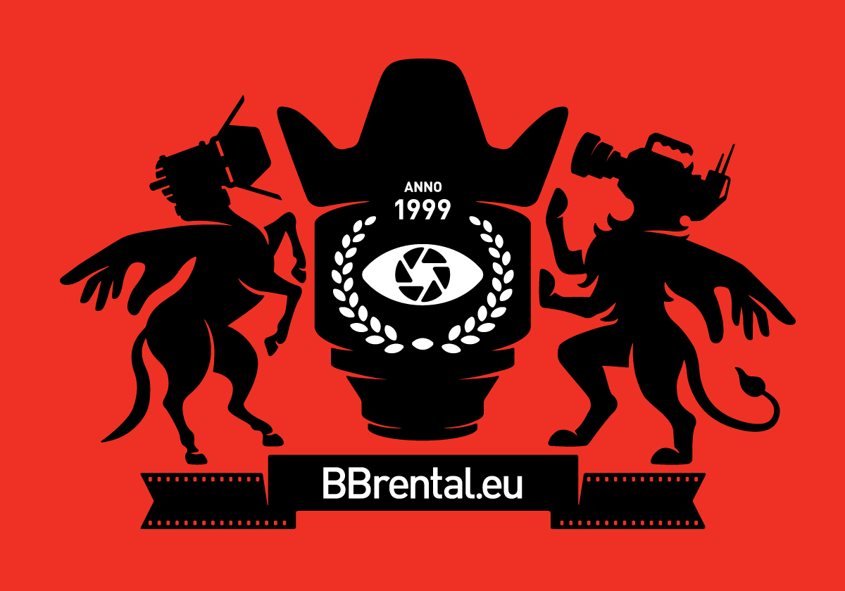
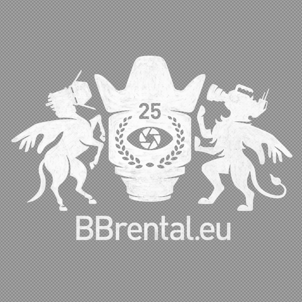
5. BBrental.eu

6. BBposthouse
7. BBstudios

8. BBfilmstore.eu

9. BBairforce